Blog

While precise targeting is crucial, even the best marketing strategies can falter with a poorly designed creative. This holds true for all ad formats, but push notifications stand out in particular. Directly delivered to devices, push ads inherently possess a heightened potential for engagement. Thus, while a stellar creative can propel your campaign to success, a subpar one has the potential to derail it entirely.
In this article, we delve into the best practices for successful push notification creatives and potential blunders to ensure your push campaigns avoid the usual traps.
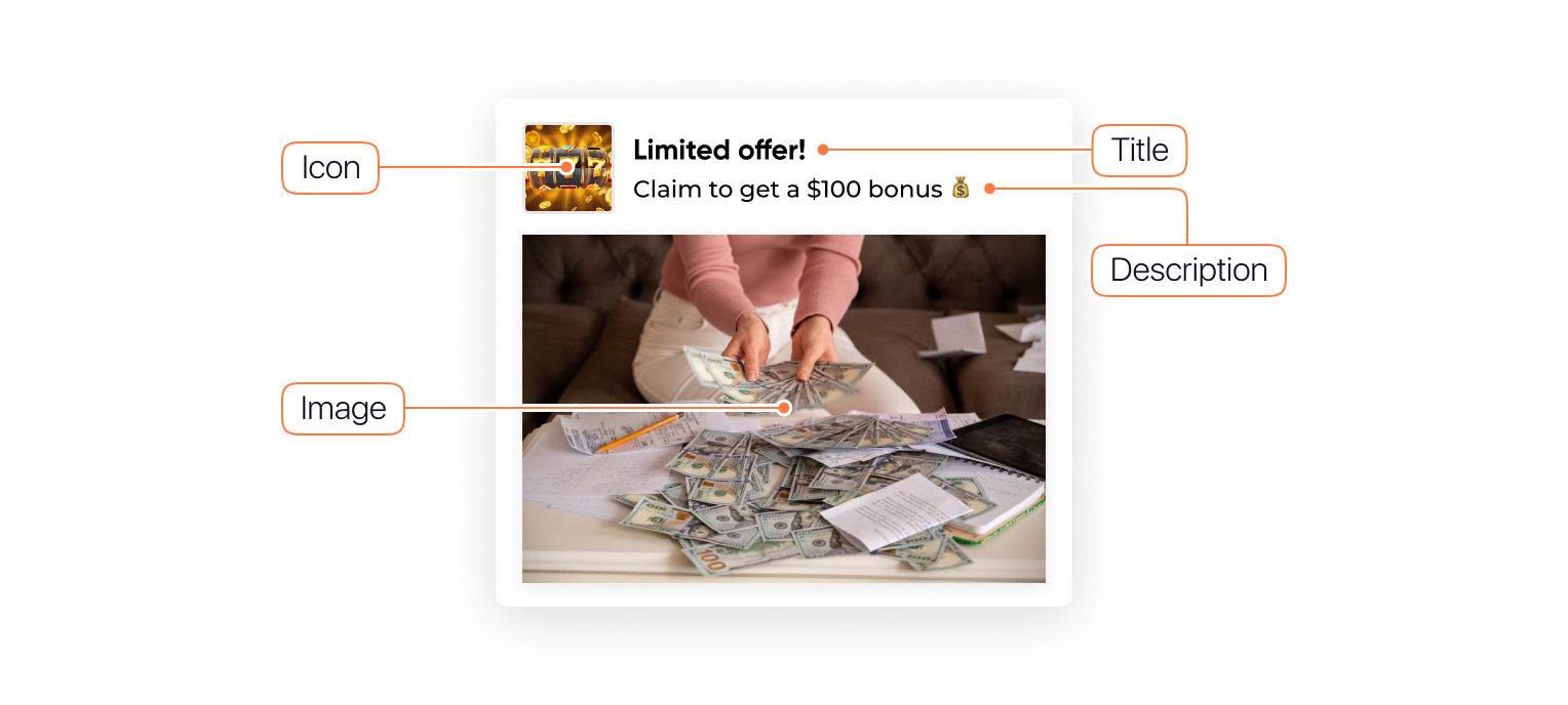
Push creatives encompass various elements that collectively convey a concise and impactful push message to the user.
Here’s a breakdown of the key components that make up a push creative:
When taken together, these elements work together to create a cohesive and compelling push creative.
Creating push creatives that truly resonate with your audience involves a strategic approach aimed at maximizing engagement and conversions.
Here are distinctive generic tips to consider:
You can transform creatives into a driving force for your push campaign by eliminating the following mistakes.
Depending on the audience, one creative might work better than another. It’s not mandatory to make several completely different creatives. Just try out another CTA, background color, or title. By testing multiple creatives, you can determine which one resonates the most with your target audience or what else should be fine-tuned to drive more traffic. As for recommendations, it’s worth testing 3-5 creatives at least.
While not always necessary, personalization can boost engagement rates, especially in verticals like dating and adult. Try simulating a one-to-one conversation, encouraging the user to start chatting on the dating website, or downloading the app for hookups.
Personalized push messages can have the following look and feel.

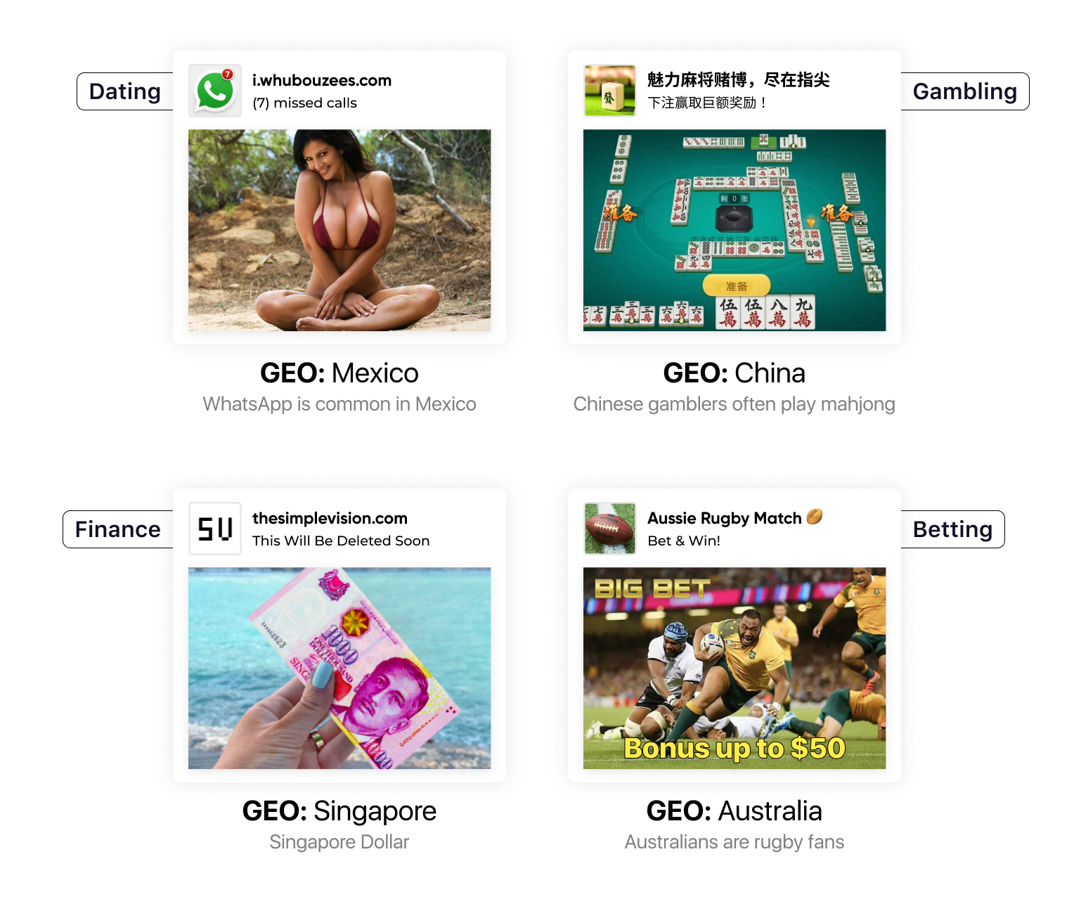
Not every message is versatile for a worldwide audience. What works in one region may not work in another, not to mention in different countries and continents. Adapting your content to local audiences means not only translating it but also culturally adjusting it.
How to localize push creatives by verticals:
Here are some best push notification examples for creating localized creatives in 2025:
Whatever vertical you deal with, you may bring in pop culture references to become closer to your audience. For instance, anime-style creatives may appeal to Japanese who adore their manga. Conversely, if you would show a cartoon image to Europeans, this method might not be so effective.
Being honest is vital for building trust. Using phrases like “You win!” or “Danger! Your phone has been infected!” can be seen as deceptive. Instead, set the right expectations with phrases such as “You may win!” or “Your phone may be at risk!”
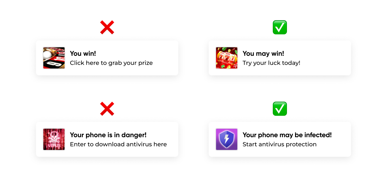
A CTA should be compelling and clear. Users should know exactly what is expected of them. Instead of vague CTAs like “Click here”, use more direct ones.
Examples of how to write texts for push notifications:
Quality matters. A blurry image can make your campaign look unprofessional. Users are more reluctant to trust or interact with creatives that have a subpar appearance. And even though this tip sounds quite mediocre, many keep using low-quality creatives for their campaigns.
The hassle-free way to fix shoddy creativities is to resort to AI tools. Similar tools continue to be released day in and day out. You can try one of them, for example, Upscale.media. This tool is cost-effective and simple to use. Testing the tool is available for all users, but downloading images requires registration.
More helpful AI-powered tools for affiliates in 2025 can be found in this post.
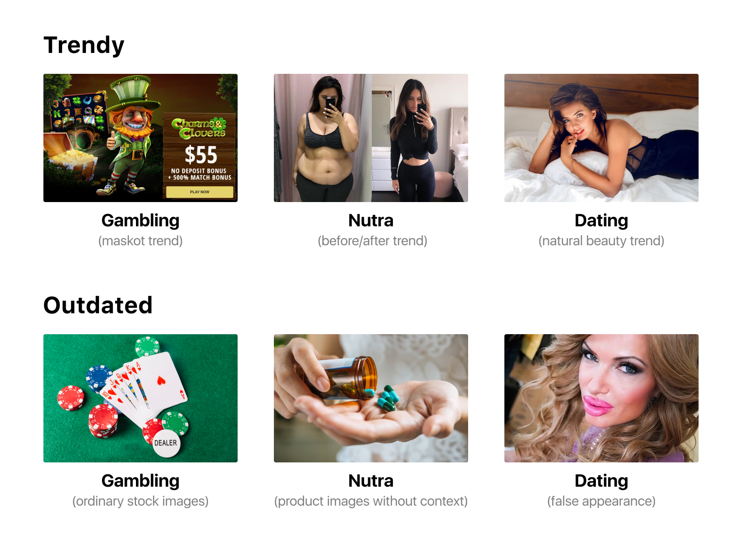
The affiliate marketing landscape evolves rapidly, and what was effective in the past might not work now. Regularly research emerging design trends, observe competitors, and experiment with new concepts to keep your creatives fresh and engaging.
Trend-following best practices and outdated images for creatives for comparison:
Analytics data is a goldmine of insights into your campaign performance. Ignoring this feedback can lead to missed opportunities for optimization. Regularly review key metrics such as click-through rates, conversion rates, and engagement rates. Use A/B testing to compare various creative elements and refine your push notification strategy based on data-driven findings.
We’ve curated the top tools for conversion tracking in the post below:
Since a considerable portion of users interact with push notifications on smartphones, it’s imperative to ensure your creatives are optimized for mobile screens. Use a responsive design approach to make sure your messages look visually appealing and are easy to read on both desktop and mobile devices.
Check out that all UX elements – buttons, forms, tabs, etc. – are working and displaying correctly on mobile devices.
While spy tools can inspire, directly copying push notification creatives can lead to saturation and reduced campaign performance. Keep in mind, that your creatives should be exclusive. Previously, we shared some insights into how to spy on rivals in the blog.
Do you already have the best push creatives at your disposal? Dive into our article about common push campaign mistakes.
And if you’re no longer a newcomer to affiliate marketing, pore over our guide on boosting CTR.
The best push notification practices are essential but never underestimate the power of experimentation. Continuously analyze the performance of your push campaigns across various scenarios. A/B testing can help you uncover what resonates best with your audience.
Remember that effective push creatives are a blend of creativity, strategic thinking, and data-driven decision-making. By avoiding common mistakes and following best practices, you can enhance engagement, build trust, and achieve the desired results with your push notification campaigns.
While precise targeting is crucial, even the best marketing strategies can falter with a poorly designed creative. This holds true for all ad formats, but push notifications stand out in particular. Directly delivered to devices, push ads inherently possess a heightened potential for engagement. Thus, while a stellar creative can propel your campaign to success, a subpar one has the potential to derail it entirely.
In this article, we delve into the best practices for successful push notification creatives and potential blunders to ensure your push campaigns avoid the usual traps.
Push creatives encompass various elements that collectively convey a concise and impactful push message to the user.
Here’s a breakdown of the key components that make up a push creative:
When taken together, these elements work together to create a cohesive and compelling push creative.

Creating push creatives that truly resonate with your audience involves a strategic approach aimed at maximizing engagement and conversions.
Here are distinctive generic tips to consider:
You can transform creatives into a driving force for your push campaign by eliminating the following mistakes.
Depending on the audience, one creative might work better than another. It’s not mandatory to make several completely different creatives. Just try out another CTA, background color, or title. By testing multiple creatives, you can determine which one resonates the most with your target audience or what else should be fine-tuned to drive more traffic. As for recommendations, it’s worth testing 3-5 creatives at least.
While not always necessary, personalization can boost engagement rates, especially in verticals like dating and adult. Try simulating a one-to-one conversation, encouraging the user to start chatting on the dating website, or downloading the app for hookups.
Personalized push messages can have the following look and feel.

Not every message is versatile for a worldwide audience. What works in one region may not work in another, not to mention in different countries and continents. Adapting your content to local audiences means not only translating it but also culturally adjusting it.
How to localize push creatives by verticals:
Here are some best push notification examples for creating localized creatives in 2025:

Whatever vertical you deal with, you may bring in pop culture references to become closer to your audience. For instance, anime-style creatives may appeal to Japanese who adore their manga. Conversely, if you would show a cartoon image to Europeans, this method might not be so effective.
Being honest is vital for building trust. Using phrases like “You win!” or “Danger! Your phone has been infected!” can be seen as deceptive. Instead, set the right expectations with phrases such as “You may win!” or “Your phone may be at risk!”

A CTA should be compelling and clear. Users should know exactly what is expected of them. Instead of vague CTAs like “Click here”, use more direct ones.
Examples of how to write texts for push notifications:
Quality matters. A blurry image can make your campaign look unprofessional. Users are more reluctant to trust or interact with creatives that have a subpar appearance. And even though this tip sounds quite mediocre, many keep using low-quality creatives for their campaigns.
The hassle-free way to fix shoddy creativities is to resort to AI tools. Similar tools continue to be released day in and day out. You can try one of them, for example, Upscale.media. This tool is cost-effective and simple to use. Testing the tool is available for all users, but downloading images requires registration.
More helpful AI-powered tools for affiliates in 2025 can be found in this post.
The affiliate marketing landscape evolves rapidly, and what was effective in the past might not work now. Regularly research emerging design trends, observe competitors, and experiment with new concepts to keep your creatives fresh and engaging.
Trend-following best practices and outdated images for creatives for comparison:

Analytics data is a goldmine of insights into your campaign performance. Ignoring this feedback can lead to missed opportunities for optimization. Regularly review key metrics such as click-through rates, conversion rates, and engagement rates. Use A/B testing to compare various creative elements and refine your push notification strategy based on data-driven findings.
We’ve curated the top tools for conversion tracking in the post below:
Since a considerable portion of users interact with push notifications on smartphones, it’s imperative to ensure your creatives are optimized for mobile screens. Use a responsive design approach to make sure your messages look visually appealing and are easy to read on both desktop and mobile devices.
Check out that all UX elements – buttons, forms, tabs, etc. – are working and displaying correctly on mobile devices.
While spy tools can inspire, directly copying push notification creatives can lead to saturation and reduced campaign performance. Keep in mind, that your creatives should be exclusive. Previously, we shared some insights into how to spy on rivals in the blog.
Do you already have the best push creatives at your disposal? Dive into our article about common push campaign mistakes.
And if you’re no longer a newcomer to affiliate marketing, pore over our guide on boosting CTR.
The best push notification practices are essential but never underestimate the power of experimentation. Continuously analyze the performance of your push campaigns across various scenarios. A/B testing can help you uncover what resonates best with your audience.
Remember that effective push creatives are a blend of creativity, strategic thinking, and data-driven decision-making. By avoiding common mistakes and following best practices, you can enhance engagement, build trust, and achieve the desired results with your push notification campaigns.

Blog

Blog