Blog
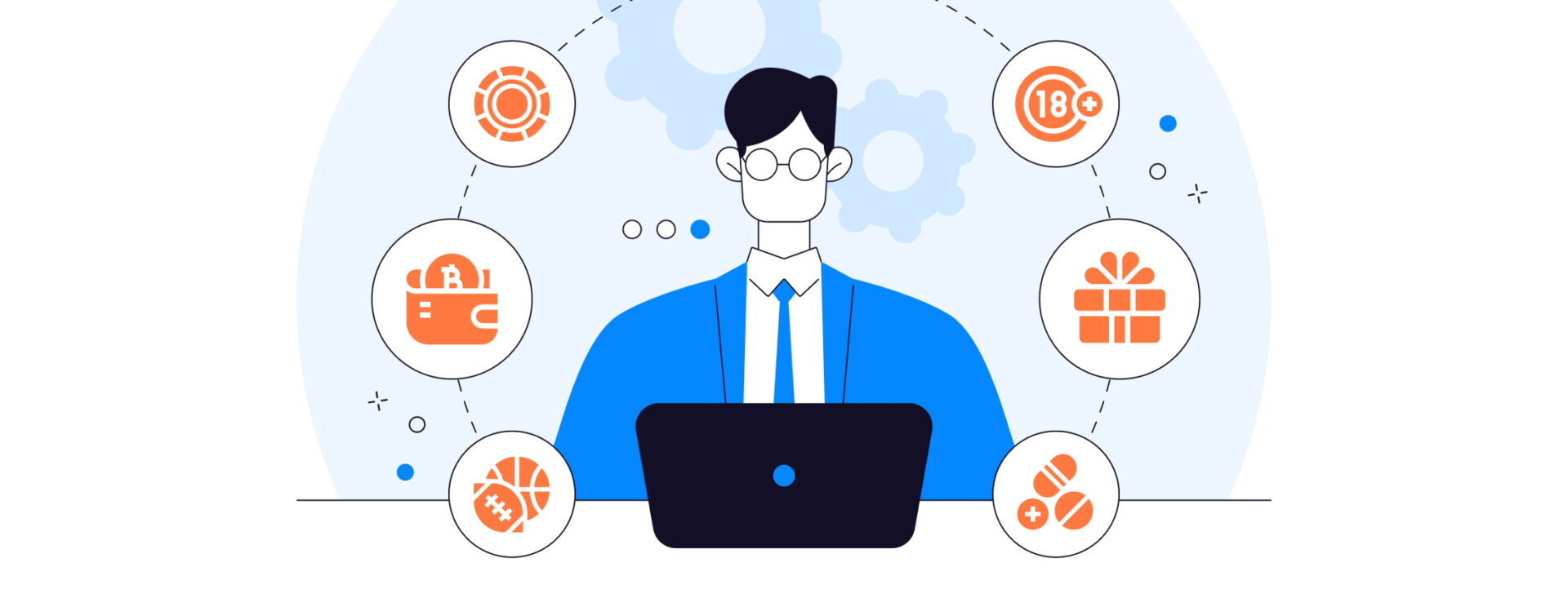
In affiliate marketing, the path from a visitor’s initial curiosity to their final commitment is shaped by 2 pivotal elements: the pre-landing and landing pages. Each plays a critical role in guiding potential customers through the sales funnel, ensuring that when they reach the call to action, they’re not just ready, but eager to commit.
In this article, we’ll dive into proven strategies for the top 10 niches in affiliate marketing:
Each niche has unique characteristics that influence how pre-landing and landing pages should be structured to guide potential customers from initial interest to committed action. Let’s explore how these elements are tailored to maximize conversions across diverse market sectors.
Pre-landing pages are web pages that precede the main or target page of a website, designed to capture visitors’ attention and stimulate their interest in further content. They typically feature attractive visual elements, concise and straightforward text, as well as interactive features to create maximum impact and guide visitors towards the main content of the site.
Pre-landings are invaluable for their ability to fine-tune the traffic that reaches your main conversion points. By effectively filtering out less interested visitors, they increase the overall quality of traffic to the landing page for affiliate marketing, enhancing both the user experience and conversion rates. This selective process means that only the most engaged visitors, those who are more likely to convert, make it through to the final call to action.
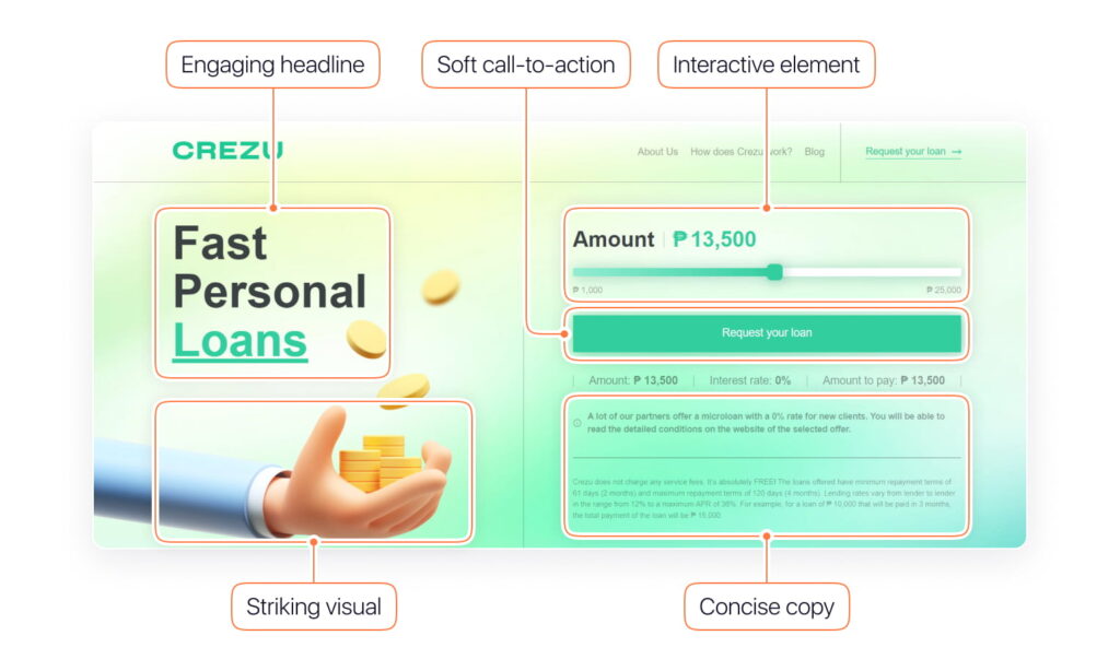
Let’s take a look at what a pre-landing page can consist of:
Landing pages, on the other hand, are where the details flourish. Here, the user finds rich content that answers questions, alleviates concerns, and persuades them to take action. This is the destination where all the initial excitement is converted into a tangible commitment, whether it’s a purchase, a sign-up, or another conversion goal.
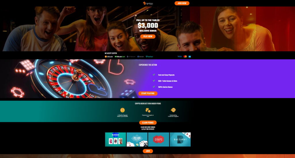
Landing can include:
Both pre-landing and landing pages play distinct roles in the conversion funnel. Pre-landing pages are about making a strong first impression and warming up the visitor, while landing pages focus on providing all necessary information and pushing towards a conversion. The success of these pages heavily depends on how well they are tailored to the audience’s expectations and the specific product or service being marketed.
The journey begins with the pre-landing page, which not only captivates but also segments potential customers by interest or intent, using tailored messaging that resonates with each visitor. This targeting is essential to warming up the audience, ensuring that they are not only curious but also ready to engage once they reach the landing page.
The conversion strategy begins once the visitor reaches the landing page. This page builds on the pre-landing page, offering deeper insights into the product or service and calling for action. Trust-building elements like testimonials, detailed benefits, and robust features guide the visitor toward making a well-informed decision.
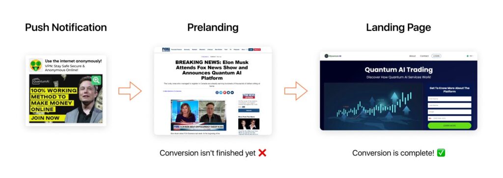
Depending on the affiliate marketing niche, there are different top angles to advertise the offer. The way you build pages varies even within a niche because each product requires its own style.
In affiliate marketing, the strategic use of pre-landing and landing pages is crucial for driving and converting traffic effectively. Once you understand the strengths of each, you can craft compelling user journeys. For instance, pre-landing pages can tease product benefits with captivating visuals, while landing pages provide detailed information and a clear call-to-action.
Let’s delve deeper into this by exploring affiliate marketing landing page examples and approaches tailored to different verticals.
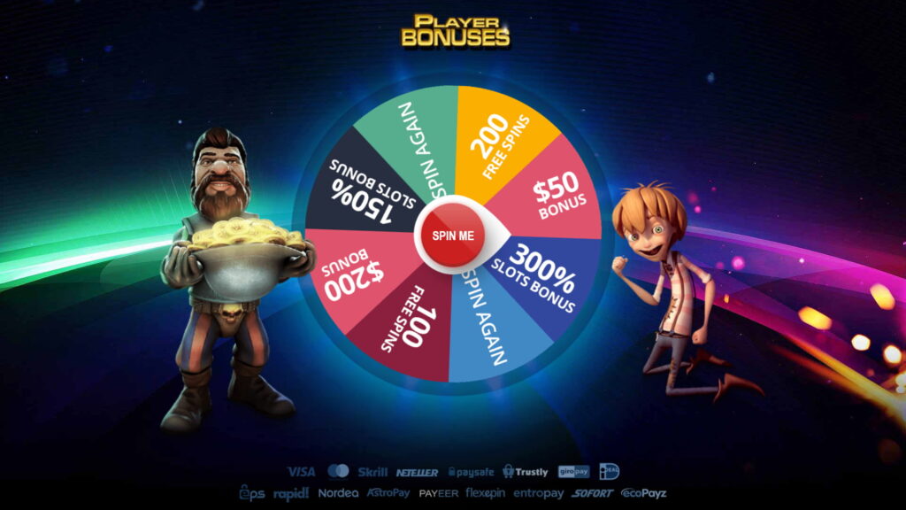
For the Gambling vertical, capturing the interest of your predominantly male audience is key. Start with a visually captivating pre-landing page featuring dynamic content such as short GIFs of slot games, previews of live casino tables, or interactive game demos. Incorporating attractive images of charismatic characters, especially female figures, can further draw attention. Headlines like “Spin to Win: Unlock Your Fortune!” or “Ready for the Rush? Join Live Tables Now!” can effectively combine the allure of potential winnings and charismatic visual elements.
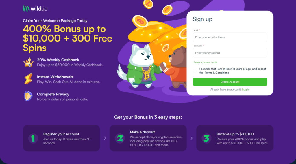
On your landing page, clearly highlight special offers such as “Claim Your 300% Welcome Bonus Now!” Use vibrant images and straightforward bullet points like “Instant access to 500+ games” to keep the message clear. Make sure your call-to-action buttons are direct and inviting, like “Join Now!” or “Get Your Bonus!”. Signups should be simple with a quick form on the landing page itself, encouraging users with phrases like “Sign Up in Seconds!”.
Examples:
You will find more details about promoting this niche in the gambling ads guide.
Tailor your approach to resonate with sports enthusiasts during key events. Start with an engaging pre-landing page that showcases the excitement of live sports. Feature high-energy images or videos of key moments from recent games, athletes in action, or even stylized shots of fans and models associated with popular sports. Captivating headlines like “Win Big with Today’s Matches!” or “Your Team, Your Bet, Your Victory!” can stir up excitement and draw bettors into the action.
On the landing page, emphasize enticing offers clearly, such as “Get a 100% Bonus on Your First Bet!” Use clear and vibrant imagery alongside bullet points stating benefits like “Access to all major leagues” and “Live betting available.” Ensure that the call-to-action buttons are straightforward and compelling, such as “Bet Now!” or “Claim Your Bonus!”.
Examples:


You will find more details about promoting this niche in the betting ads guide.
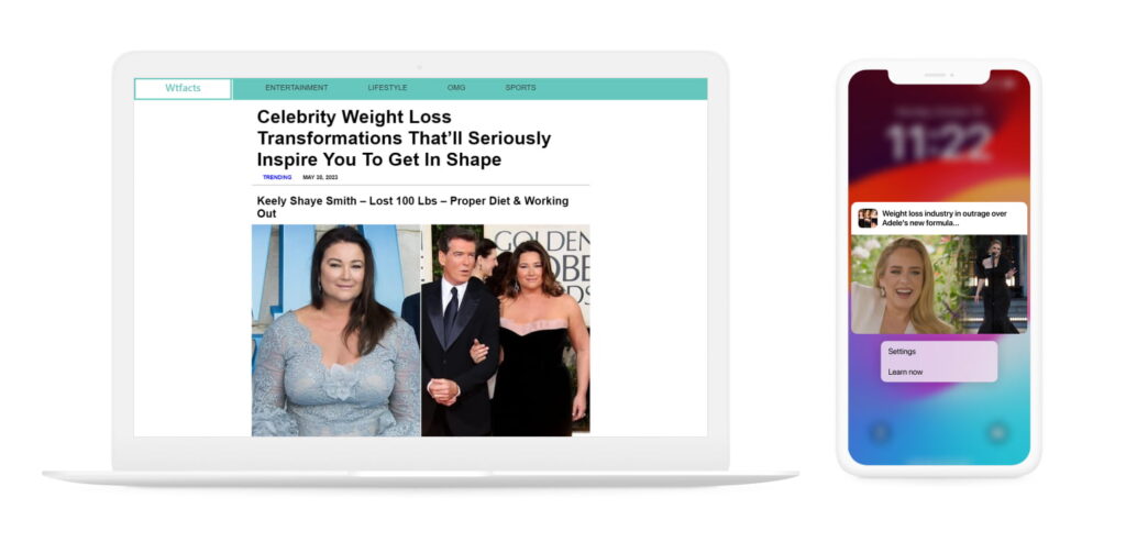
In the Nutra industry, where health is at stake, customers often approach products with caution, needing substantial information before they make a purchase. Initiating their journey with a well-informed pre-landing page can significantly enhance engagement. This could involve sharing in-depth articles that detail the benefits and scientific research behind your products. Effective headlines might include “Unlock the Power of Natural Supplements” or “Real Stories, Real Results: Discover How Our Products Work.”
Utilizing success stories and testimonials on your pre-landing page is crucial as these elements offer social proof that can sway potential customers.
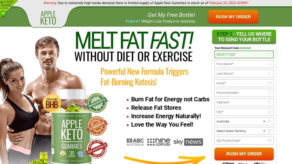
Transition to the landing page by continuing to emphasize trust and efficacy. Here, detailed descriptions of the products, complete with lists of ingredients and their proven benefits, should take center stage. Calls-to-action such as “Improve Your Health Today!” or “Take the First Step Towards a New You!” should be clear and motivating. To add an element of urgency, consider including limited-time offers or a countdown to special promotions.
Examples:
You will find more details about promoting this niche in the nutra ads guide.
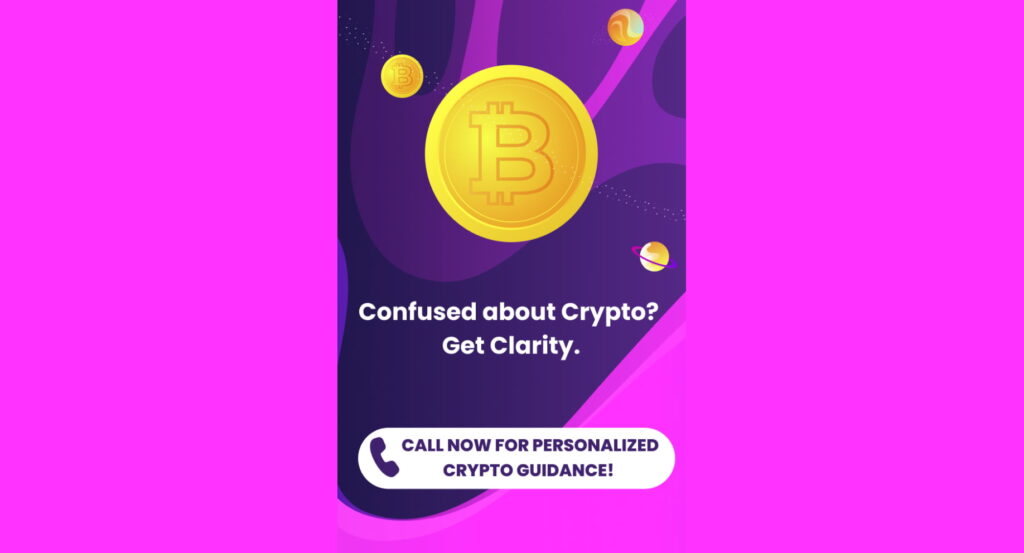
The approach to creating target pages for promoting Crypto depends on your target audience.
If you target newbies, begin with pre-landings that simplify the entry into cryptocurrency. Utilize tutorials and guides as a primary tool to engage those new to the market. Feature images and headlines that depict an attractive lifestyle and promise effortless passive income. For example, use headlines like “Unlock Your Financial Freedom with Crypto” or “Earn Passive Income Effortlessly.”
Your pre-landing page could include tutorials or links to blog posts about blockchain technologies, potentially directing users to a detailed course page. This educational approach helps demystify crypto for newcomers, making the investment concept more accessible.
When targeting experienced crypto investors, use pre-landers or landing pages that offer valuable industry insights, expert articles, or analysis that can enhance their trading skills. Ensure that the benefits of the products or services are prominently displayed, and consider offering bonuses or gifts for registration to incentivize sign-ups. For instance, “Register Now and Receive Exclusive Trading Insights” or “Join Today for Bonus Credits” can be effective.
Examples:

You will find more details about promoting this niche in the crypto ads guide.
Start with engaging visuals of attractive individuals or romantic settings to capture initial interest. Incorporate simple interactive elements like quizzes or straightforward questions such as “Ready to meet someone special?” or “Are you looking for love?” These interactions are designed to be engaging yet easy, enhancing user engagement. For adult-oriented offers, add an age verification step (“Are you 18 or older?”) to filter the audience appropriately.
Build on the engagement from the pre-landing page with a seamless transition to your landing page, where the user is prompted to take action. Use clear, compelling calls-to-action like “Join Now to Connect” or “Meet Your Match Today!” The sign-up process should be direct and simple, with minimal steps to maintain user motivation. Use high-quality images that reflect the community and values of your dating service to reinforce the message and encourage registration.
Examples:


You will find more details about promoting this niche in the dating ads guide.
Create a personalized experience by incorporating interactive elements like questionnaires and quizzes that adapt content based on the responses of users. Complement these with a straightforward age verification step, using tasteful imagery to keep users engaged. Clear and direct warning messages set the tone and expectations about the adult content, efficiently filtering out non-target audiences. To reach a larger audience, embrace the diversity of the adult audience by incorporating specific content for various orientations and preferences.
Examples:

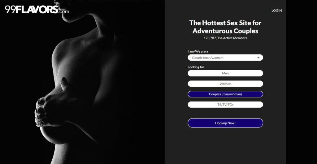
Ensure the design of the landing page remains visually appealing, aligning with the expectations set by the pre-landing page and reinforcing the adult content tastefully. Simplify the sign-up process to reduce barriers to entry, facilitating a smooth and quick transition that helps maximize conversion rates.
This article fully describes the approaches to creating adult pre-landings and landing pages:
Integrating quizzes and questionnaires can personalize the user experience by assessing their financial needs and preferences, which helps in presenting more tailored offers. For example, incorporating a finance questionnaire that asks users about their investment goals or credit needs can connect them with the most relevant services. Alongside the questionnaire, emphasize the competitive advantages of your offers, such as “Loan approved in just 1 hour,” to make your service stand out.
When users transition to the landing page, having tools like a loan calculator allows them to interact directly with the product by adjusting loan amounts or repayment terms, providing them with instant, personalized options. This hands-on approach not only boosts engagement but also enhances user understanding of your service.
Ensure the landing page provides a comprehensive yet straightforward view of your financial services. Display transparent terms, real-time market data, and essential information clearly to empower users to make informed decisions.
Examples:


You will find more details about promoting this niche in the finance ads guide.
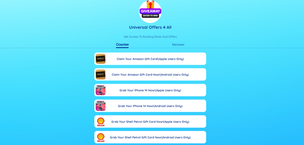
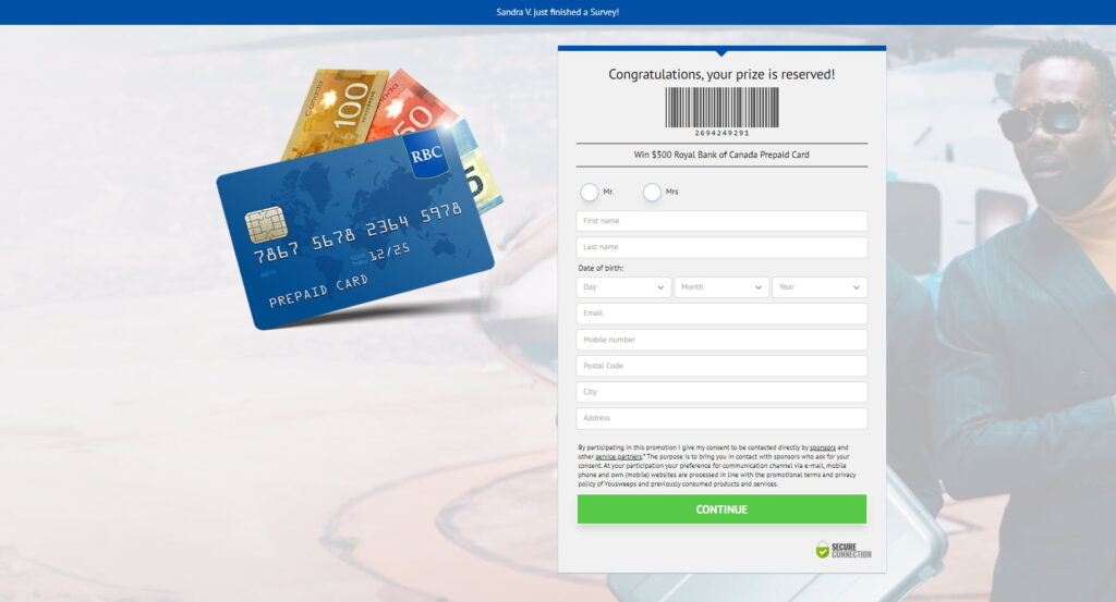
Sweepstakes is an engaging niche that thrives on excitement and the allure of winning. To effectively tap into this enthusiasm, both pre-landing and landing pages must be crafted with user engagement and simplicity in mind.
Pre-landing pages should incorporate interactive elements such as playable mechanics and questionnaires. Playable mechanics like a “Fortunate Wheel” or “Gift Boxes” game engage users by offering a fun, game-like experience where they can feel the thrill of chance directly. These elements make the sweepstakes tangible and enticing right from the start. Additionally, utilize questionnaires to gather essential user information in a non-intrusive way. Simple questions about the user’s GEO, device type, and gender help to tailor the experience.
Examples:
You will find more details about promoting this niche in the sweepstakes ads guide.
For utility software and applications, the pre-landing page should immediately communicate the practical benefits and efficiency of the product. Use engaging visuals or interactive demos that allow users to see the utility app in action. For example, feature a dynamic screenshot sequence or a short video demonstration that highlights quick problem-solving or easy integration with other tools. Messaging like “Boost Your Productivity” or “Simplify Your Daily Tasks” can quickly resonate with potential users looking for solutions to specific problems.
On the landing page, delve deeper into the features and advantages of your utility app. Provide detailed descriptions of key functionalities and how they solve common or complex problems. Use bullet points for clarity and quick reading, and include high-quality images or icons that represent the features aesthetically. A strong, clear call-to-action like “Download Now” or “Start Your Free Trial” should be prominently placed.
Examples:
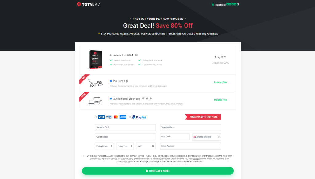
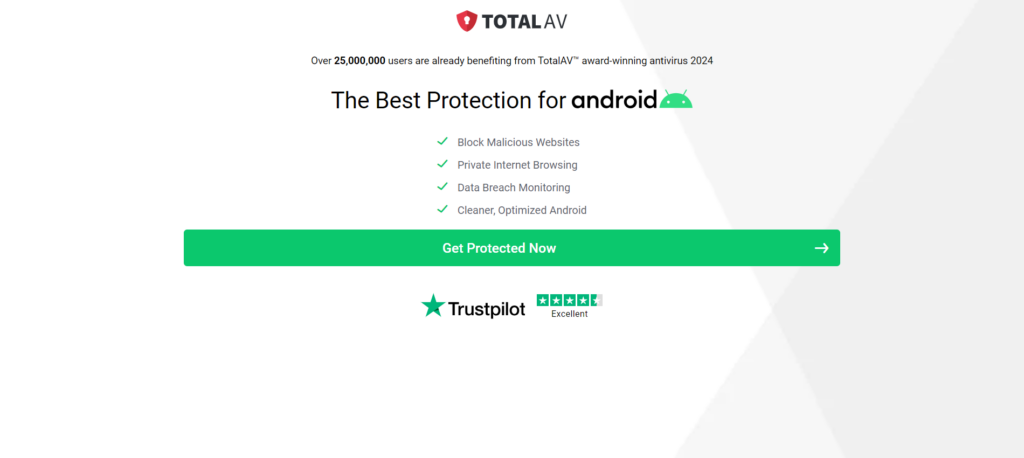
You will find more details about promoting this niche in the mobile ads guide.
The pre-landing page for a VPN service should immediately highlight the key benefits like enhanced security, privacy protection, and the ability to bypass geographical restrictions. Use dynamic visuals or animations that show a simplified user’s data being encrypted or a map animation showcasing global content access. Messaging like “Secure Your Online Activities” or “Access Global Content from Anywhere” can instantly appeal to users seeking privacy and unrestricted internet access.
On the landing page, provide more detailed information about the VPN’s features and how they benefit the user. This might include enhanced security protocols, no-logs policies, high-speed connections, and the variety of server locations available. Use clear and concise bullet points to detail these features, complemented by icons or small graphics that enhance readability and user interest.
Examples:
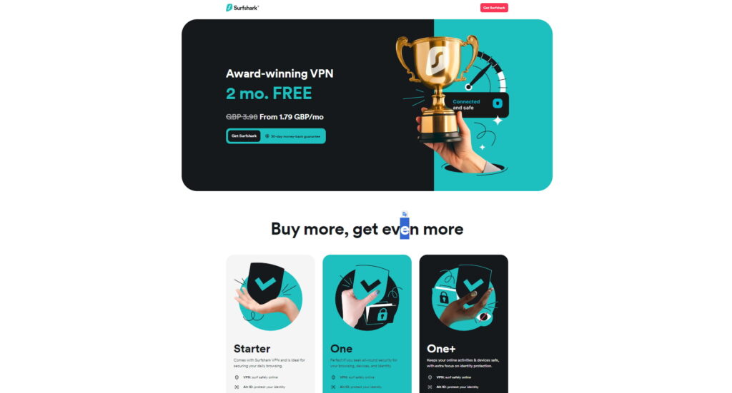
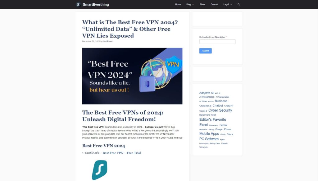
Keep in mind, that the first touch to your ad campaign is your ad creatives. If you deal with a push campaign, discover how to avoid common push mistakes.
As you develop your affiliate marketing strategies, remember the importance of creative testing. By experimenting with at least five different creatives for your pre-landing and landing pages, you can discover what truly resonates with your audience. This approach doesn’t just attract visitors – it helps retain their interest and guides them smoothly through the conversion process. Embrace this strategy to refine your pages, ensuring they not only capture attention but also drive action, thereby maximizing your campaigns’ effectiveness in any niche.
In affiliate marketing, the path from a visitor’s initial curiosity to their final commitment is shaped by 2 pivotal elements: the pre-landing and landing pages. Each plays a critical role in guiding potential customers through the sales funnel, ensuring that when they reach the call to action, they’re not just ready, but eager to commit.
In this article, we’ll dive into proven strategies for the top 10 niches in affiliate marketing:
Each niche has unique characteristics that influence how pre-landing and landing pages should be structured to guide potential customers from initial interest to committed action. Let’s explore how these elements are tailored to maximize conversions across diverse market sectors.
Pre-landing pages are web pages that precede the main or target page of a website, designed to capture visitors’ attention and stimulate their interest in further content. They typically feature attractive visual elements, concise and straightforward text, as well as interactive features to create maximum impact and guide visitors towards the main content of the site.
Pre-landings are invaluable for their ability to fine-tune the traffic that reaches your main conversion points. By effectively filtering out less interested visitors, they increase the overall quality of traffic to the landing page for affiliate marketing, enhancing both the user experience and conversion rates. This selective process means that only the most engaged visitors, those who are more likely to convert, make it through to the final call to action.

Let’s take a look at what a pre-landing page can consist of:
Landing pages, on the other hand, are where the details flourish. Here, the user finds rich content that answers questions, alleviates concerns, and persuades them to take action. This is the destination where all the initial excitement is converted into a tangible commitment, whether it’s a purchase, a sign-up, or another conversion goal.

Landing can include:
Both pre-landing and landing pages play distinct roles in the conversion funnel. Pre-landing pages are about making a strong first impression and warming up the visitor, while landing pages focus on providing all necessary information and pushing towards a conversion. The success of these pages heavily depends on how well they are tailored to the audience’s expectations and the specific product or service being marketed.
The journey begins with the pre-landing page, which not only captivates but also segments potential customers by interest or intent, using tailored messaging that resonates with each visitor. This targeting is essential to warming up the audience, ensuring that they are not only curious but also ready to engage once they reach the landing page.
The conversion strategy begins once the visitor reaches the landing page. This page builds on the pre-landing page, offering deeper insights into the product or service and calling for action. Trust-building elements like testimonials, detailed benefits, and robust features guide the visitor toward making a well-informed decision.

Depending on the affiliate marketing niche, there are different top angles to advertise the offer. The way you build pages varies even within a niche because each product requires its own style.
In affiliate marketing, the strategic use of pre-landing and landing pages is crucial for driving and converting traffic effectively. Once you understand the strengths of each, you can craft compelling user journeys. For instance, pre-landing pages can tease product benefits with captivating visuals, while landing pages provide detailed information and a clear call-to-action.
Let’s delve deeper into this by exploring affiliate marketing landing page examples and approaches tailored to different verticals.
For the Gambling vertical, capturing the interest of your predominantly male audience is key. Start with a visually captivating pre-landing page featuring dynamic content such as short GIFs of slot games, previews of live casino tables, or interactive game demos. Incorporating attractive images of charismatic characters, especially female figures, can further draw attention. Headlines like “Spin to Win: Unlock Your Fortune!” or “Ready for the Rush? Join Live Tables Now!” can effectively combine the allure of potential winnings and charismatic visual elements.
On your landing page, clearly highlight special offers such as “Claim Your 300% Welcome Bonus Now!” Use vibrant images and straightforward bullet points like “Instant access to 500+ games” to keep the message clear. Make sure your call-to-action buttons are direct and inviting, like “Join Now!” or “Get Your Bonus!”. Signups should be simple with a quick form on the landing page itself, encouraging users with phrases like “Sign Up in Seconds!”.
Examples:


You will find more details about promoting this niche in the gambling ads guide.
Tailor your approach to resonate with sports enthusiasts during key events. Start with an engaging pre-landing page that showcases the excitement of live sports. Feature high-energy images or videos of key moments from recent games, athletes in action, or even stylized shots of fans and models associated with popular sports. Captivating headlines like “Win Big with Today’s Matches!” or “Your Team, Your Bet, Your Victory!” can stir up excitement and draw bettors into the action.
On the landing page, emphasize enticing offers clearly, such as “Get a 100% Bonus on Your First Bet!” Use clear and vibrant imagery alongside bullet points stating benefits like “Access to all major leagues” and “Live betting available.” Ensure that the call-to-action buttons are straightforward and compelling, such as “Bet Now!” or “Claim Your Bonus!”.
Examples:


You will find more details about promoting this niche in the betting ads guide.
In the Nutra industry, where health is at stake, customers often approach products with caution, needing substantial information before they make a purchase. Initiating their journey with a well-informed pre-landing page can significantly enhance engagement. This could involve sharing in-depth articles that detail the benefits and scientific research behind your products. Effective headlines might include “Unlock the Power of Natural Supplements” or “Real Stories, Real Results: Discover How Our Products Work.”
Utilizing success stories and testimonials on your pre-landing page is crucial as these elements offer social proof that can sway potential customers.
Transition to the landing page by continuing to emphasize trust and efficacy. Here, detailed descriptions of the products, complete with lists of ingredients and their proven benefits, should take center stage. Calls-to-action such as “Improve Your Health Today!” or “Take the First Step Towards a New You!” should be clear and motivating. To add an element of urgency, consider including limited-time offers or a countdown to special promotions.
Examples:


You will find more details about promoting this niche in the nutra ads guide.
The approach to creating target pages for promoting Crypto depends on your target audience.
If you target newbies, begin with pre-landings that simplify the entry into cryptocurrency. Utilize tutorials and guides as a primary tool to engage those new to the market. Feature images and headlines that depict an attractive lifestyle and promise effortless passive income. For example, use headlines like “Unlock Your Financial Freedom with Crypto” or “Earn Passive Income Effortlessly.”
Your pre-landing page could include tutorials or links to blog posts about blockchain technologies, potentially directing users to a detailed course page. This educational approach helps demystify crypto for newcomers, making the investment concept more accessible.
When targeting experienced crypto investors, use pre-landers or landing pages that offer valuable industry insights, expert articles, or analysis that can enhance their trading skills. Ensure that the benefits of the products or services are prominently displayed, and consider offering bonuses or gifts for registration to incentivize sign-ups. For instance, “Register Now and Receive Exclusive Trading Insights” or “Join Today for Bonus Credits” can be effective.
Examples:


You will find more details about promoting this niche in the crypto ads guide.
Start with engaging visuals of attractive individuals or romantic settings to capture initial interest. Incorporate simple interactive elements like quizzes or straightforward questions such as “Ready to meet someone special?” or “Are you looking for love?” These interactions are designed to be engaging yet easy, enhancing user engagement. For adult-oriented offers, add an age verification step (“Are you 18 or older?”) to filter the audience appropriately.
Build on the engagement from the pre-landing page with a seamless transition to your landing page, where the user is prompted to take action. Use clear, compelling calls-to-action like “Join Now to Connect” or “Meet Your Match Today!” The sign-up process should be direct and simple, with minimal steps to maintain user motivation. Use high-quality images that reflect the community and values of your dating service to reinforce the message and encourage registration.
Examples:


You will find more details about promoting this niche in the dating ads guide.
Create a personalized experience by incorporating interactive elements like questionnaires and quizzes that adapt content based on the responses of users. Complement these with a straightforward age verification step, using tasteful imagery to keep users engaged. Clear and direct warning messages set the tone and expectations about the adult content, efficiently filtering out non-target audiences. To reach a larger audience, embrace the diversity of the adult audience by incorporating specific content for various orientations and preferences.
Examples:


Ensure the design of the landing page remains visually appealing, aligning with the expectations set by the pre-landing page and reinforcing the adult content tastefully. Simplify the sign-up process to reduce barriers to entry, facilitating a smooth and quick transition that helps maximize conversion rates.
This article fully describes the approaches to creating adult pre-landings and landing pages:
Integrating quizzes and questionnaires can personalize the user experience by assessing their financial needs and preferences, which helps in presenting more tailored offers. For example, incorporating a finance questionnaire that asks users about their investment goals or credit needs can connect them with the most relevant services. Alongside the questionnaire, emphasize the competitive advantages of your offers, such as “Loan approved in just 1 hour,” to make your service stand out.
When users transition to the landing page, having tools like a loan calculator allows them to interact directly with the product by adjusting loan amounts or repayment terms, providing them with instant, personalized options. This hands-on approach not only boosts engagement but also enhances user understanding of your service.
Ensure the landing page provides a comprehensive yet straightforward view of your financial services. Display transparent terms, real-time market data, and essential information clearly to empower users to make informed decisions.
Examples:


You will find more details about promoting this niche in the finance ads guide.
Sweepstakes is an engaging niche that thrives on excitement and the allure of winning. To effectively tap into this enthusiasm, both pre-landing and landing pages must be crafted with user engagement and simplicity in mind.
Pre-landing pages should incorporate interactive elements such as playable mechanics and questionnaires. Playable mechanics like a “Fortunate Wheel” or “Gift Boxes” game engage users by offering a fun, game-like experience where they can feel the thrill of chance directly. These elements make the sweepstakes tangible and enticing right from the start. Additionally, utilize questionnaires to gather essential user information in a non-intrusive way. Simple questions about the user’s GEO, device type, and gender help to tailor the experience.
Examples:


You will find more details about promoting this niche in the sweepstakes ads guide.
For utility software and applications, the pre-landing page should immediately communicate the practical benefits and efficiency of the product. Use engaging visuals or interactive demos that allow users to see the utility app in action. For example, feature a dynamic screenshot sequence or a short video demonstration that highlights quick problem-solving or easy integration with other tools. Messaging like “Boost Your Productivity” or “Simplify Your Daily Tasks” can quickly resonate with potential users looking for solutions to specific problems.
On the landing page, delve deeper into the features and advantages of your utility app. Provide detailed descriptions of key functionalities and how they solve common or complex problems. Use bullet points for clarity and quick reading, and include high-quality images or icons that represent the features aesthetically. A strong, clear call-to-action like “Download Now” or “Start Your Free Trial” should be prominently placed.
Examples:


You will find more details about promoting this niche in the mobile ads guide.
The pre-landing page for a VPN service should immediately highlight the key benefits like enhanced security, privacy protection, and the ability to bypass geographical restrictions. Use dynamic visuals or animations that show a simplified user’s data being encrypted or a map animation showcasing global content access. Messaging like “Secure Your Online Activities” or “Access Global Content from Anywhere” can instantly appeal to users seeking privacy and unrestricted internet access.
On the landing page, provide more detailed information about the VPN’s features and how they benefit the user. This might include enhanced security protocols, no-logs policies, high-speed connections, and the variety of server locations available. Use clear and concise bullet points to detail these features, complemented by icons or small graphics that enhance readability and user interest.
Examples:


Keep in mind, that the first touch to your ad campaign is your ad creatives. If you deal with a push campaign, discover how to avoid common push mistakes.
As you develop your affiliate marketing strategies, remember the importance of creative testing. By experimenting with at least five different creatives for your pre-landing and landing pages, you can discover what truly resonates with your audience. This approach doesn’t just attract visitors – it helps retain their interest and guides them smoothly through the conversion process. Embrace this strategy to refine your pages, ensuring they not only capture attention but also drive action, thereby maximizing your campaigns’ effectiveness in any niche.

Blog

Blog