Blog

In 2025, the dating vertical still leads the pack in affiliate marketing, known for its strong conversion rates. This article will explore the top pre-landing and landing pages that are effectively attracting and engaging users in your dating offers.
We’ll highlight real-world examples that demonstrate how specific design choices and content strategies can significantly increase user interaction and conversions. Dive into these proven solutions to refine your approach and achieve better results in your dating ad campaigns.
Here’s how a dating landing page and a pre-landing page work seamlessly together:
Pre-Landing pages: These are the teasers. They’re where you catch the user’s interest, usually with a compelling story, intriguing questions, or relatable scenarios. The goal here is to create curiosity and engagement without overwhelming with too many details. Think of a pre-landing for Dating as a light appetizer that hints at the main course.
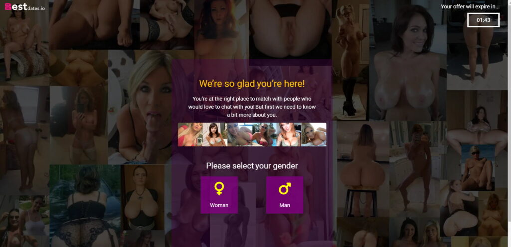
Landing pages: Following the pre-landing page, the landing page serves as the main course. This is where you present a clear and direct call to action (CTA). Here, users find detailed information about the dating service, testimonials, and stronger assurances. The landing page addresses any reservations a potential user might have and convinces them to take the plunge – be it signing up, downloading an app, or starting a free trial.
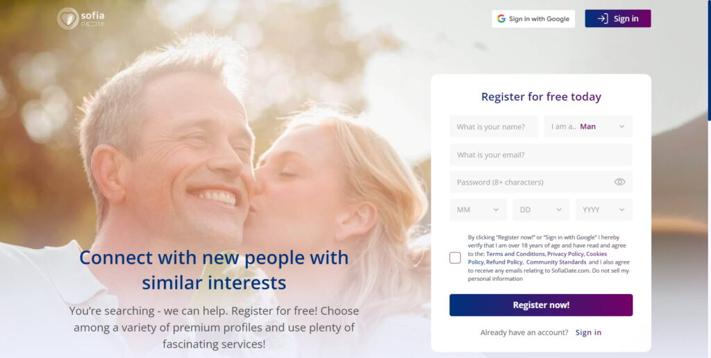
The magic happens when these two pages effectively speak to each other. The pre-landing page warms up the audience, building interest and emotional investment, while the landing page closes the deal with logic and persuasive elements. Together, they create a narrative journey that leads users from initial curiosity to enthusiastic action.
If you are dealing with the discussed vertical, you may be interested in our guide for dating advertising.
We’ve collected the best pre-landing examples for Dating to catch users’ attention before they move into the main offer.
Questions are powerful tools to engage users right off the bat. Use questions that provoke thought and evoke emotions, tailored to dating preferences. Ask simple questions so that users don’t have to think about how to answer and quickly convert into leads.
Dating pre-landing examples:

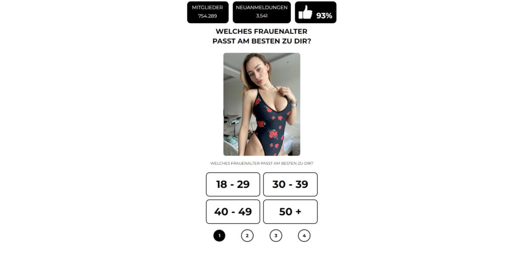
In this case, using emojis in answer choices simplifies user interaction by providing immediate, visual responses that don’t require reading.
Questions are a good hook to grab the attention of users. Keep in mind, they need to cover the majority of your audience to be effective. So, add more options besides the traditional ones.
Look at the example highlighting other options, in addition to classic genders: men and women.
Dating pre-landing examples:
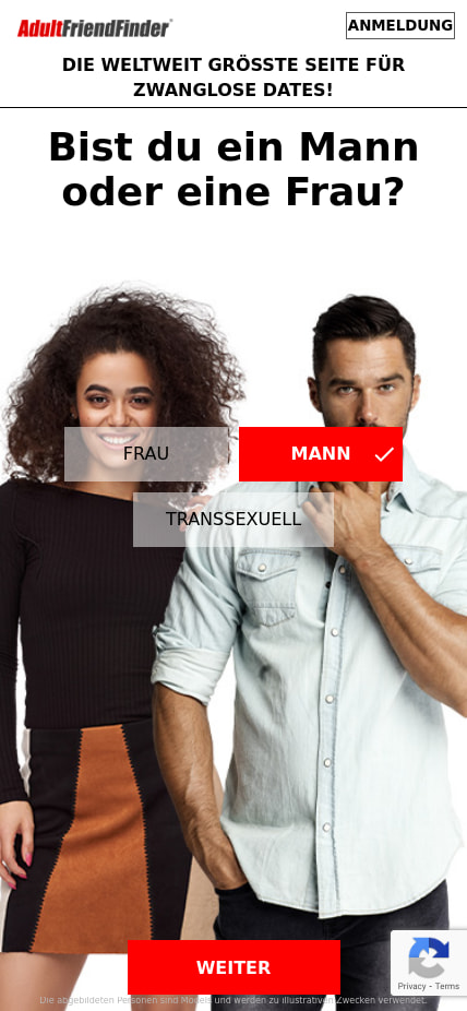
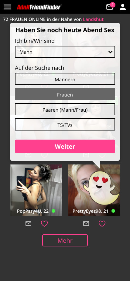
Diversity is key in this vertical, but ultimately all depends on your target audience and their tastes.
Incorporate testimonials from a diverse group of users who can speak to the inclusiveness and success of your dating site. Seeing real stories from individuals who might share similar backgrounds or identities can greatly enhance trust and relatability.
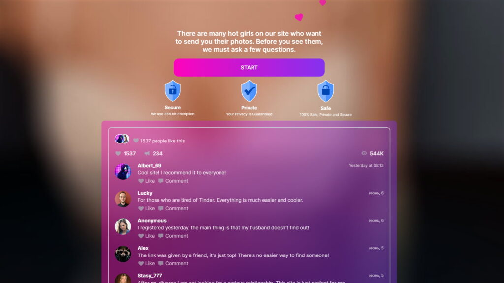
In the dating vertical, interaction is everything – highlight this on your target pages by promising immediate access to chatting. Emphasize the ease of starting conversations right after signup or just clicking the CTA button. As a rule of thumb, users should be promised something valuable in exchange for their actions.
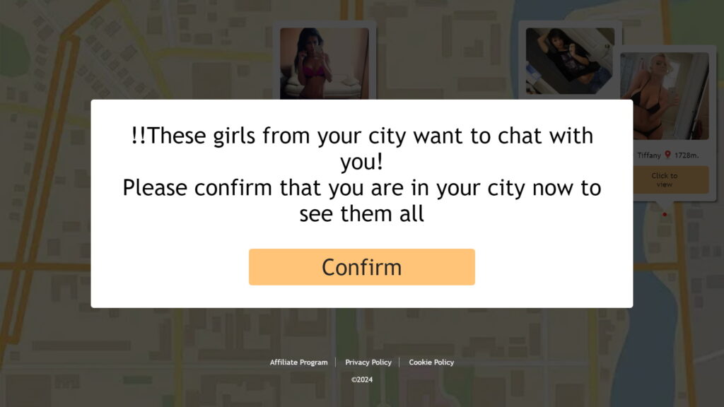
Quizzes and engaging questions are effective strategies for drawing users to mainstream dating offers, but another simple yet powerful approach is to present photos and allow users to select what appeals to them. This technique is also particularly effective for and adult pre-landing pages, as it taps directly into personal preferences at first glance.

To craft a successful dating category pre-landing page, focus on entertainment and simplicity. Instead of overwhelming users with lengthy explanations or dense articles, use engaging mechanics like interactive quizzes, instant polls, and eye-catching photo selections. These elements keep the experience light and enjoyable, encouraging users to engage with the content.
Creating an effective landing page for dating offers involves a more complex approach than pre-landing pages. While a pre-landing page might only require one screen and a single engaging mechanic to capture initial interest, a landing page needs multiple screens that gradually unveil the full value of the offer.
We’ve compiled successful techniques from various landing pages into one section.
Place a signup form prominently on the first screen. This makes it clear from the start what action you want users to take, streamlining the process for quicker conversions.
Examples of dating landing pages:


Incorporate elements of social proof such as testimonials, user reviews, and success stories. These build credibility and trust, showing potential users the real-world benefits and satisfaction others have experienced.

Using diverse сalls to action (CTAs) throughout your page helps remind users repeatedly about what you want them to do. Repeating important information in various ways can make users more likely to take action.
This is the same landing page with several CTAs:



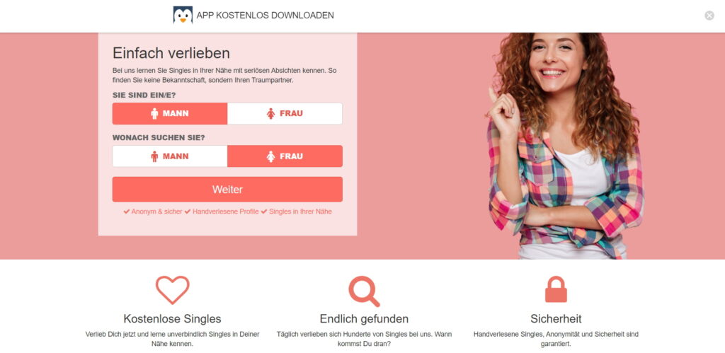
Tailor your landing page to specific geographical locations, respecting cultural nuances and preferences. What works in one region might not be effective in another. Localizing content can also involve adjusting the language, idioms, and cultural references so that they resonate more effectively with local audiences.
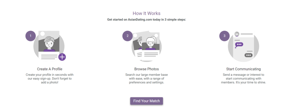
Even if your offer is simple, always explain how it works. This helps users imagine how they might use it in their own lives, making it easier for them to see the benefits and decide to engage.
Additionally, continuously testing different landing page templates and tracking their effectiveness is crucial for refining your strategies and maximizing ROI. Advanced tools for measuring key performance metrics of your ad campaigns and landing pages are often provided by dating ad networks. Familiarizing yourself with the best dating ad networks for 2025.
Сreating successful dating pre-landing and landing pages means making every step of the user journey engaging and seamless. By incorporating interactive elements, diverse calls to action, and localized content, you can significantly boost engagement and conversions. Keep your approach flexible and continuously optimize based on what works best for your audience. This not only enhances user experience but also drives better results for your campaigns.
In 2025, the dating vertical still leads the pack in affiliate marketing, known for its strong conversion rates. This article will explore the top pre-landing and landing pages that are effectively attracting and engaging users in your dating offers.
We’ll highlight real-world examples that demonstrate how specific design choices and content strategies can significantly increase user interaction and conversions. Dive into these proven solutions to refine your approach and achieve better results in your dating ad campaigns.
Here’s how a dating landing page and a pre-landing page work seamlessly together:
Pre-Landing pages: These are the teasers. They’re where you catch the user’s interest, usually with a compelling story, intriguing questions, or relatable scenarios. The goal here is to create curiosity and engagement without overwhelming with too many details. Think of a pre-landing for Dating as a light appetizer that hints at the main course.

Landing pages: Following the pre-landing page, the landing page serves as the main course. This is where you present a clear and direct call to action (CTA). Here, users find detailed information about the dating service, testimonials, and stronger assurances. The landing page addresses any reservations a potential user might have and convinces them to take the plunge – be it signing up, downloading an app, or starting a free trial.

The magic happens when these two pages effectively speak to each other. The pre-landing page warms up the audience, building interest and emotional investment, while the landing page closes the deal with logic and persuasive elements. Together, they create a narrative journey that leads users from initial curiosity to enthusiastic action.
If you are dealing with the discussed vertical, you may be interested in our guide for dating advertising.
We’ve collected the best pre-landing examples for Dating to catch users’ attention before they move into the main offer.
Questions are powerful tools to engage users right off the bat. Use questions that provoke thought and evoke emotions, tailored to dating preferences. Ask simple questions so that users don’t have to think about how to answer and quickly convert into leads.
Dating pre-landing examples:


In this case, using emojis in answer choices simplifies user interaction by providing immediate, visual responses that don’t require reading.
Questions are a good hook to grab the attention of users. Keep in mind, they need to cover the majority of your audience to be effective. So, add more options besides the traditional ones.
Look at the example highlighting other options, in addition to classic genders: men and women.
Dating pre-landing examples:


Diversity is key in this vertical, but ultimately all depends on your target audience and their tastes.
Incorporate testimonials from a diverse group of users who can speak to the inclusiveness and success of your dating site. Seeing real stories from individuals who might share similar backgrounds or identities can greatly enhance trust and relatability.

In the dating vertical, interaction is everything – highlight this on your target pages by promising immediate access to chatting. Emphasize the ease of starting conversations right after signup or just clicking the CTA button. As a rule of thumb, users should be promised something valuable in exchange for their actions.

Quizzes and engaging questions are effective strategies for drawing users to mainstream dating offers, but another simple yet powerful approach is to present photos and allow users to select what appeals to them. This technique is also particularly effective for and adult pre-landing pages, as it taps directly into personal preferences at first glance.

To craft a successful dating category pre-landing page, focus on entertainment and simplicity. Instead of overwhelming users with lengthy explanations or dense articles, use engaging mechanics like interactive quizzes, instant polls, and eye-catching photo selections. These elements keep the experience light and enjoyable, encouraging users to engage with the content.
Creating an effective landing page for dating offers involves a more complex approach than pre-landing pages. While a pre-landing page might only require one screen and a single engaging mechanic to capture initial interest, a landing page needs multiple screens that gradually unveil the full value of the offer.
We’ve compiled successful techniques from various landing pages into one section.
Place a signup form prominently on the first screen. This makes it clear from the start what action you want users to take, streamlining the process for quicker conversions.
Examples of dating landing pages:


Incorporate elements of social proof such as testimonials, user reviews, and success stories. These build credibility and trust, showing potential users the real-world benefits and satisfaction others have experienced.

Using diverse сalls to action (CTAs) throughout your page helps remind users repeatedly about what you want them to do. Repeating important information in various ways can make users more likely to take action.
This is the same landing page with several CTAs:


Tailor your landing page to specific geographical locations, respecting cultural nuances and preferences. What works in one region might not be effective in another. Localizing content can also involve adjusting the language, idioms, and cultural references so that they resonate more effectively with local audiences.
Even if your offer is simple, always explain how it works. This helps users imagine how they might use it in their own lives, making it easier for them to see the benefits and decide to engage.

Additionally, continuously testing different landing page templates and tracking their effectiveness is crucial for refining your strategies and maximizing ROI. Advanced tools for measuring key performance metrics of your ad campaigns and landing pages are often provided by dating ad networks. Familiarizing yourself with the best dating ad networks for 2025.
Сreating successful dating pre-landing and landing pages means making every step of the user journey engaging and seamless. By incorporating interactive elements, diverse calls to action, and localized content, you can significantly boost engagement and conversions. Keep your approach flexible and continuously optimize based on what works best for your audience. This not only enhances user experience but also drives better results for your campaigns.

Blog

Blog