Blog

The Adult vertical is a subject of controversial regulations from traffic sources. Therefore, the funnel of a typical 18+ ad campaign usually includes a pre-landing page – an effective tool to entice potential customers. This way, the ad campaign can pass moderation successfully, unless a pre-landing doesn’t depict full nudity. And although the web is flooded with sexual content, the odds that explicit campaigns cannot be blocked are 50-50. But what’s the point of risking it? Why not attract users with effective target pages that won’t get you banned?
This article highlights the best examples of pre-landing pages for the Adult niche. We’ll not only showcase the top practices but also talk about principles on how to create well-performing pages to resonate with your audience and get your ad campaign approved.
A pre-landing page acts as an intermediary step between the initial ad click and the final landing page where the main conversion action takes place (such as a subscription, sale, or sign-up).
To make sense of the nature of landing pages and pre-landings, look into their difference:
| Aspect | Pre-landing | Landing Page |
|---|---|---|
| Technical side | Serves as an intermediary step between a creative and a landing page. | The final destination is designed for conversion, such as making a purchase, signing up, or subscribing. It’s where the user’s commitment is solidified. |
| Elements and blocks | Pre-landing pages generally use more provocative and engaging visual elements designed to capture attention quickly and effectively. These might include bold headlines, striking images, or interactive elements like quizzes. | Landing pages, in contrast, may use a mix of detailed content, testimonials, and more explicit imagery (where appropriate) to persuade the user toward conversion. |
| Content | Pre-landing pages often contain less text, using concise and compelling copy to quickly convey the value proposition and tease what’s to come. | Landing pages, meanwhile, provide detailed information, benefits, and features of the offer, aiming to answer all potential questions a user might have and remove any barriers to conversion. |
| Compliance and discretion | Especially in the Adult Dating vertical, pre-landers are designed with a keen eye on compliance, avoiding explicit content to pass ad platform regulations. | Landing pages, having already filtered through interested and engaged users, can afford to be more explicit, provided they still comply with legal standards. |
| CTA | A CTA is typically geared towards moving the user to the next step in the funnel (i.e., the landing page). It might be more exploratory, like “Learn More” or “Join Now”. | CTAs are direct and conversion-focused, such as “Subscribe Now,” “Join,” or “Sign Up”. |
Clearly, target pages play distinct yet interconnected roles in the affiliate marketing funnel, especially within the Adult Dating category.
Also, you can find top 7 strategies for Adult website advertising in our comprehensive article.
Here’s why pre-landings are essential in the Adult niche:
Pre-landing pages serve to warm up visitors, gradually introducing them to the offer. This is particularly important in the Adult vertical, where building trust and comfort with the content is vital. A well-crafted pre-landing page can ease visitors into the more explicit or sensitive content they’ll encounter on the main landing page, reducing bounce rates and increasing the likelihood of conversion.
They allow marketers to tailor the messaging for different audience segments effectively. In the Adult industry, where audience preferences can vary widely, pre-landing pages can be customized to appeal to specific interests, leading to higher click-through rates. One of the most powerful techniques for achieving this personalized approach is the use of questionnaires and quizzes.
By providing a buffer that prepares visitors for what to expect, pre-landing pages can significantly increase conversion rates. They play a critical role in filtering out uninterested traffic, ensuring that only the most engaged visitors reach the main landing page, ready to take action.
In this section, we’re set to explore diverse types of Adult pre-landing examples, each designed with unique mechanisms to captivate and engage the audience effectively.
Questionnaires and quizzes make the user feel like the content is being tailored specifically for them, increasing the chances of engagement and conversion. They engage users right from the start by asking them to answer a series of questions or participate in a quiz. This not only captures their attention but also allows marketers to gather valuable insights into their preferences and interests. Based on the responses, the pre-lander can dynamically adjust the content, images, and Adult Dating offers to better match the user’s specific desires.
We’ll give you a few screenshots of completely different pre-landing pages with questionnaires or quizzes:



This is the simplest pre-landing page easy to implement. The purpose of the pre-landing is to filter out unwanted traffic – the audience aged under 24. It wouldn’t be superfluous to add an attractive image featuring a woman, presented without full nudity.
Examples of pre-landing pages:



Above all, the pre-landing in an Adult campaign acts as a filter to winnow out the non-target audience. It’s essential to capture attention on a dime, indicating what’s the purpose of the offer, and conversely, what the offer doesn’t aim to achieve.
It’s allowed to not be very creative here. Use expressions like “This is not a dating site”, “Warning” and “Attention”. Given the lack of explicit creatives, the message must be as direct as possible.
Adult pre-landing examples:


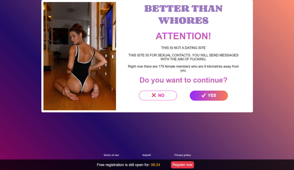
It’s important not to overlook minorities, as they constitute a significant portion of the audience interested in 18+ offers. As the 2023 Pew survey reports, 1 out of 5 persons have used Tinder in their 50s. When it comes to lesbian, gay and bisexual adults, 54% have used an Adult dating platform or app at least once.
How can look a mature Adult dating landing page or pre-landing:

The pre-landing page intended for gays:

Okay, we have already figured pre-landing pages for minorities out, but what about traditional heterosexuals? These guys are probably already spoiled by the variety of Adult content that suits their orientation. To satisfy this audience, offer them several options. Each will find according to their taste. Anyway, interactive techniques work out better than straightforward CTAs and lack of options.
Examples:

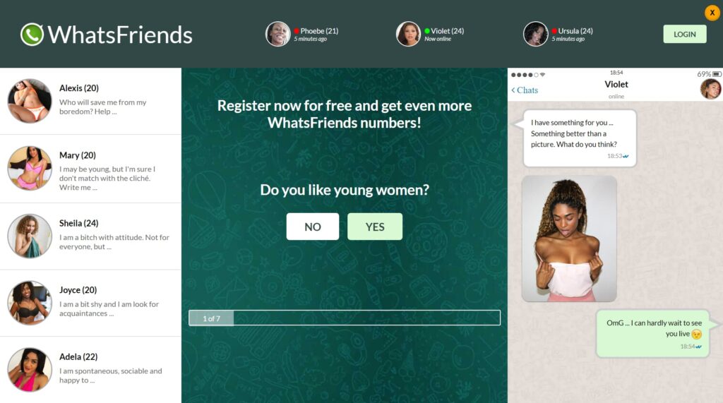
Alongside the chat interface from the second sample, users are offered to answer the questions. In doing so, 2 approaches are combined here: using questionnaires to create personal appeal and diversity display for higher chances to convert.
Some ad networks help with developing creatives for Adult ad campaigns. Check these 12 best Adult ad networks in 2025.
If you are going to run an Adult ad campaign without pre-landing for some reason, you need to make sure your destination page doesn’t violate the content policy of your traffic source. However, you should not neglect to create a pre-landing, even if you are dealing with a mainstream dating offer. Pre-landers provide an additional layer for testing different approaches and messages. This flexibility allows you to optimize your marketing funnel based on real user data and feedback.
Common requirements of many platforms for landing pages are lack of pornography or any explicit content that could be taken as offensive.
Landing page examples that pass moderation smoothly:


Tailoring pre-landing page elements for Adult ad campaigns involves special considerations to engage and convert your targeted audience effectively.
Here’s how you can adapt these elements:
The skill to create captivating target pages isn’t still enough for running fruitful 18+ ad campaigns. Read our guide on the Adult vertical to have a knack for this niche.
When you’re mapping out your funnel, don’t skip on the pre-landing pages – they’re your chance to connect directly with your audience, making them feel seen and understood. Plus, in the realm of the Adult vertical, where catching the eye while playing by the rules is key, high-quality pages are your best bet to make a memorable impression. Keep it real, keep it respectful, and you’ll see your campaigns not just pass moderation but truly resonate with the folks you’re trying to reach.
The Adult vertical is a subject of controversial regulations from traffic sources. Therefore, the funnel of a typical 18+ ad campaign usually includes a pre-landing page – an effective tool to entice potential customers. This way, the ad campaign can pass moderation successfully, unless a pre-landing doesn’t depict full nudity. And although the web is flooded with sexual content, the odds that explicit campaigns cannot be blocked are 50-50. But what’s the point of risking it? Why not attract users with effective target pages that won’t get you banned?
This article highlights the best examples of pre-landing pages for the Adult niche. We’ll not only showcase the top practices but also talk about principles on how to create well-performing pages to resonate with your audience and get your ad campaign approved.
A pre-landing page acts as an intermediary step between the initial ad click and the final landing page where the main conversion action takes place (such as a subscription, sale, or sign-up).
To make sense of the nature of landing pages and pre-landings, look into their difference:
| Aspect | Pre-landing | Landing Page |
|---|---|---|
| Technical side | Serves as an intermediary step between a creative and a landing page. | The final destination is designed for conversion, such as making a purchase, signing up, or subscribing. It’s where the user’s commitment is solidified. |
| Elements and blocks | Pre-landing pages generally use more provocative and engaging visual elements designed to capture attention quickly and effectively. These might include bold headlines, striking images, or interactive elements like quizzes. | Landing pages, in contrast, may use a mix of detailed content, testimonials, and more explicit imagery (where appropriate) to persuade the user toward conversion. |
| Content | Pre-landing pages often contain less text, using concise and compelling copy to quickly convey the value proposition and tease what’s to come. | Landing pages, meanwhile, provide detailed information, benefits, and features of the offer, aiming to answer all potential questions a user might have and remove any barriers to conversion. |
| Compliance and discretion | Especially in the Adult Dating vertical, pre-landers are designed with a keen eye on compliance, avoiding explicit content to pass ad platform regulations. | Landing pages, having already filtered through interested and engaged users, can afford to be more explicit, provided they still comply with legal standards. |
| CTA | A CTA is typically geared towards moving the user to the next step in the funnel (i.e., the landing page). It might be more exploratory, like “Learn More” or “Join Now”. | CTAs are direct and conversion-focused, such as “Subscribe Now,” “Join,” or “Sign Up”. |
Clearly, target pages play distinct yet interconnected roles in the affiliate marketing funnel, especially within the Adult Dating category.
Also, you can find top 7 strategies for Adult website advertising in our comprehensive article.
Here’s why pre-landings are essential in the Adult niche:
Pre-landing pages serve to warm up visitors, gradually introducing them to the offer. This is particularly important in the Adult vertical, where building trust and comfort with the content is vital. A well-crafted pre-landing page can ease visitors into the more explicit or sensitive content they’ll encounter on the main landing page, reducing bounce rates and increasing the likelihood of conversion.
They allow marketers to tailor the messaging for different audience segments effectively. In the Adult industry, where audience preferences can vary widely, pre-landing pages can be customized to appeal to specific interests, leading to higher click-through rates. One of the most powerful techniques for achieving this personalized approach is the use of questionnaires and quizzes.
By providing a buffer that prepares visitors for what to expect, pre-landing pages can significantly increase conversion rates. They play a critical role in filtering out uninterested traffic, ensuring that only the most engaged visitors reach the main landing page, ready to take action.
In this section, we’re set to explore diverse types of Adult pre-landing examples, each designed with unique mechanisms to captivate and engage the audience effectively.
Questionnaires and quizzes make the user feel like the content is being tailored specifically for them, increasing the chances of engagement and conversion. They engage users right from the start by asking them to answer a series of questions or participate in a quiz. This not only captures their attention but also allows marketers to gather valuable insights into their preferences and interests. Based on the responses, the pre-lander can dynamically adjust the content, images, and Adult Dating offers to better match the user’s specific desires.
We’ll give you a few screenshots of completely different pre-landing pages with questionnaires or quizzes:


This is the simplest pre-landing page easy to implement. The purpose of the pre-landing is to filter out unwanted traffic – the audience aged under 24. It wouldn’t be superfluous to add an attractive image featuring a woman, presented without full nudity.
Examples of pre-landing pages:


Above all, the pre-landing in an Adult campaign acts as a filter to winnow out the non-target audience. It’s essential to capture attention on a dime, indicating what’s the purpose of the offer, and conversely, what the offer doesn’t aim to achieve.
It’s allowed to not be very creative here. Use expressions like “This is not a dating site”, “Warning” and “Attention”. Given the lack of explicit creatives, the message must be as direct as possible.
Adult pre-landing examples:


It’s important not to overlook minorities, as they constitute a significant portion of the audience interested in 18+ offers. As the 2023 Pew survey reports, 1 out of 5 persons have used Tinder in their 50s. When it comes to lesbian, gay and bisexual adults, 54% have used an Adult dating platform or app at least once.
How can look a mature Adult dating landing page or pre-landing:

The pre-landing page intended for gays:

Okay, we have already figured pre-landing pages for minorities out, but what about traditional heterosexuals? These guys are probably already spoiled by the variety of Adult content that suits their orientation. To satisfy this audience, offer them several options. Each will find according to their taste. Anyway, interactive techniques work out better than straightforward CTAs and lack of options.
Examples:


Alongside the chat interface from the second sample, users are offered to answer the questions. In doing so, 2 approaches are combined here: using questionnaires to create personal appeal and diversity display for higher chances to convert.
Some ad networks help with developing creatives for Adult ad campaigns. Check these 12 best Adult ad networks in 2025.
If you are going to run an Adult ad campaign without pre-landing for some reason, you need to make sure your destination page doesn’t violate the content policy of your traffic source. However, you should not neglect to create a pre-landing, even if you are dealing with a mainstream dating offer. Pre-landers provide an additional layer for testing different approaches and messages. This flexibility allows you to optimize your marketing funnel based on real user data and feedback.
Common requirements of many platforms for landing pages are lack of pornography or any explicit content that could be taken as offensive.
Landing page examples that pass moderation smoothly:


Tailoring pre-landing page elements for Adult ad campaigns involves special considerations to engage and convert your targeted audience effectively.
Here’s how you can adapt these elements:
The skill to create captivating target pages isn’t still enough for running fruitful 18+ ad campaigns. Read our guide on the Adult vertical to have a knack for this niche.
When you’re mapping out your funnel, don’t skip on the pre-landing pages – they’re your chance to connect directly with your audience, making them feel seen and understood. Plus, in the realm of the Adult vertical, where catching the eye while playing by the rules is key, high-quality pages are your best bet to make a memorable impression. Keep it real, keep it respectful, and you’ll see your campaigns not just pass moderation but truly resonate with the folks you’re trying to reach.

Blog

Blog