Blog
Adding well-crafted icons to your notifications can skyrocket their effectiveness. Icons can grab attention, reinforce your message, and help boost click-through rates (CTR). Let’s dive into the best practices for using push notification icons, along with some tips.
An icon enters the set of elements that together make up a push notification.
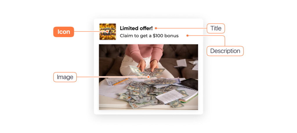
All components of a push notification:
Now, let’s overview the topic of our article – push notification icons.
Push notification icons are small visual elements that accompany the text in a push notification. These icons can be app logos, action-specific images, or personalized symbols that enhance the notification’s message. Icons are crucial in grabbing users’ attention, providing context, and encouraging them to engage with the notification.
Icons act as visual triggers that help users quickly recognize the app and understand the notification’s purpose. As mobile users are often flooded with notifications, a well-designed icon can make all the difference in standing out from the crowd. Here’s why they matter:
Are you eager to create wonderful and well-performed push ads? Hurry to learn more about best practices for creating push notifications!
Let’s review best practices for using push icons. Take note of our tips to make your push ad messages noticed.
Users respond well to icons they recognize. Therefore, you can confidently design your icons to resemble those used by popular apps or brands. Icons of widely recognized companies like WhatsApp, Gmail, or FB Messenger can create a sense of familiarity and trust, making users more likely to engage with your notification. For example, WhatsApp’s green speech bubble or Tinder’s flame icon are easily identifiable and instantly signal to the user what kind of message is coming through.
Push notification icon examples:
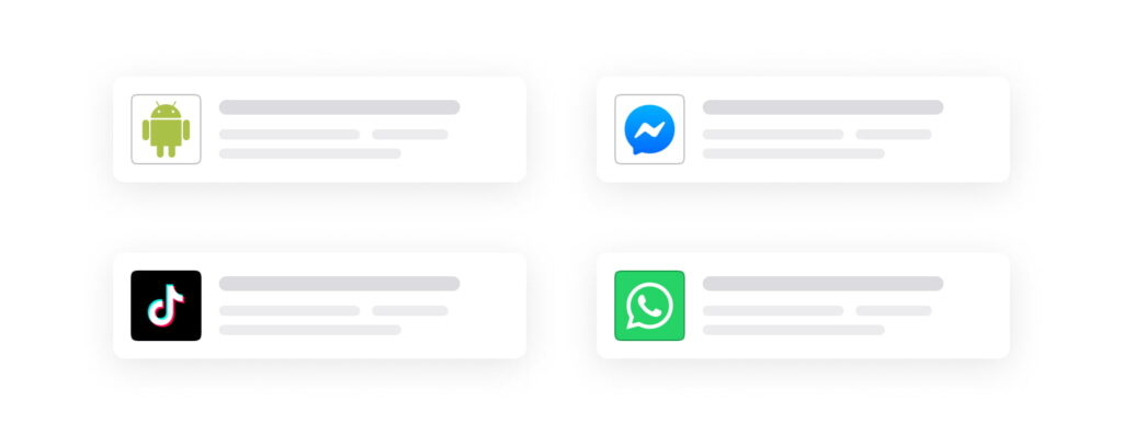
Tip: If you advertise a recognizable product or service (Amazon, Nike, etc.), use their logo.
Icon badges are the small circles or dots that appear on app icons when there’s a new notification delivered. These badges act as visual reminders that there’s something new or important awaiting the user, encouraging them to open and interact with the notification.
Such a subtle nudge can significantly boost the likelihood of a user clicking on the notification. For example, a badge showing an unread message count will prompt the user to check their messages or notifications more frequently.
Push notification icon examples:

Tip: Combining icon badges with well-designed push notifications is an excellent strategy to keep users engaged with your app. Badges should be clear and not overly intrusive; they work best when used sparingly for notifications that matter – such as new messages, updates, or sales.
Interactive icons, such as GIFs or video previews, are an emerging trend in push notification design that can dramatically enhance user engagement. These dynamic elements are more eye-catching than static icons, and they offer a unique way to convey movement, emotion, or urgency. When a push notification includes an interactive icon, it stands out from the usual flood of messages.
Instead of a static image, interactive icons can be animated in the form of GIFs or short video snippets. These icons can quickly communicate additional context for the notification. For example:
Push notification icon examples:

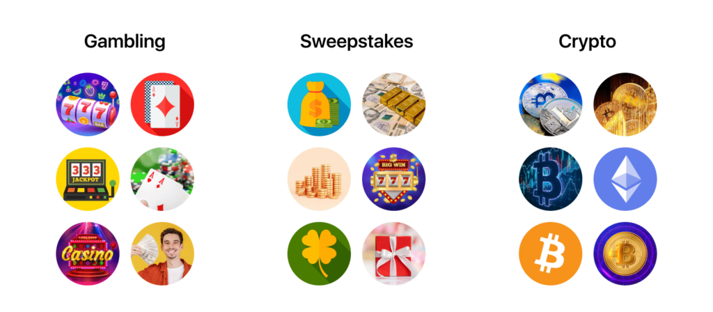
The icon should be simple and coupled with the main image. To ensure your offer essence stands out, align your visuals seamlessly with your niche.
Here are examples of good push notification icons:
A/B testing your push notification icons can provide insights into what works best for your audience. Test various designs, from minimalist symbols to more detailed images, and see which resonates more with your users.
Tip: Some ad networks have in their ad inventory the Creative Management feature (this feature can have another name depending on the platform). The option automatically rotates creatives by their performance. Anyway, check out the stats and report to see which creatives are performing the best.
An icon is only one of the elements of push notifications, so it’s worth mentioning recommendations on creating push notifications altogether.
Here are distinctive generic tips to consider:
There are also some pitfalls in creating push ads – read the article about popular push campaign mistakes to avoid them.
Push notifications don’t seem like a big deal, but they’re powerful for grabbing users’ attention. While sites like Icons8 provide great icons, we recommend choosing visuals that align closely with your offer. One easy approach is using icons directly from ad networks. For instance, RichAds allows you to download icons for push notifications absolutely for free! Galaksion – another ad network – has a creative library tailored for affiliates. These platforms can help make your notifications stand out and resonate with your target audience.
Adding well-crafted icons to your notifications can skyrocket their effectiveness. Icons can grab attention, reinforce your message, and help boost click-through rates (CTR). Let’s dive into the best practices for using push notification icons, along with some tips.
An icon enters the set of elements that together make up a push notification.

All components of a push notification:
Now, let’s overview the topic of our article – push notification icons.
Push notification icons are small visual elements that accompany the text in a push notification. These icons can be app logos, action-specific images, or personalized symbols that enhance the notification’s message. Icons are crucial in grabbing users’ attention, providing context, and encouraging them to engage with the notification.
Icons act as visual triggers that help users quickly recognize the app and understand the notification’s purpose. As mobile users are often flooded with notifications, a well-designed icon can make all the difference in standing out from the crowd. Here’s why they matter:
Are you eager to create wonderful and well-performed push ads? Hurry to learn more about best practices for creating push notifications!
Let’s review best practices for using push icons. Take note of our tips to make your push ad messages noticed.
Users respond well to icons they recognize. Therefore, you can confidently design your icons to resemble those used by popular apps or brands. Icons of widely recognized companies like WhatsApp, Gmail, or FB Messenger can create a sense of familiarity and trust, making users more likely to engage with your notification. For example, WhatsApp’s green speech bubble or Tinder’s flame icon are easily identifiable and instantly signal to the user what kind of message is coming through.
Push notification icon examples:

Tip: If you advertise a recognizable product or service (Amazon, Nike, etc.), use their logo.
Icon badges are the small circles or dots that appear on app icons when there’s a new notification delivered. These badges act as visual reminders that there’s something new or important awaiting the user, encouraging them to open and interact with the notification.
Such a subtle nudge can significantly boost the likelihood of a user clicking on the notification. For example, a badge showing an unread message count will prompt the user to check their messages or notifications more frequently.
Push notification icon examples:

Tip: Combining icon badges with well-designed push notifications is an excellent strategy to keep users engaged with your app. Badges should be clear and not overly intrusive; they work best when used sparingly for notifications that matter – such as new messages, updates, or sales.
Interactive icons, such as GIFs or video previews, are an emerging trend in push notification design that can dramatically enhance user engagement. These dynamic elements are more eye-catching than static icons, and they offer a unique way to convey movement, emotion, or urgency. When a push notification includes an interactive icon, it stands out from the usual flood of messages.
Instead of a static image, interactive icons can be animated in the form of GIFs or short video snippets. These icons can quickly communicate additional context for the notification. For example:
Push notification icon examples:

The icon should be simple and coupled with the main image. To ensure your offer essence stands out, align your visuals seamlessly with your niche.
Here are examples of good push notification icons:

A/B testing your push notification icons can provide insights into what works best for your audience. Test various designs, from minimalist symbols to more detailed images, and see which resonates more with your users.
Tip: Some ad networks have in their ad inventory the Creative Management feature (this feature can have another name depending on the platform). The option automatically rotates creatives by their performance. Anyway, check out the stats and report to see which creatives are performing the best.
An icon is only one of the elements of push notifications, so it’s worth mentioning recommendations on creating push notifications altogether.
Here are distinctive generic tips to consider:
There are also some pitfalls in creating push ads – read the article about popular push campaign mistakes to avoid them.
Push notifications don’t seem like a big deal, but they’re powerful for grabbing users’ attention. While sites like Icons8 provide great icons, we recommend choosing visuals that align closely with your offer. One easy approach is using icons directly from ad networks. For instance, RichAds allows you to download icons for push notifications absolutely for free! Galaksion – another ad network – has a creative library tailored for affiliates. These platforms can help make your notifications stand out and resonate with your target audience.
Blog

Blog