Blog

When you’re trying to capture the attention of potential investors or users, your pre-landing and landing pages must be top-notch. If you’re dealing with the crypto vertical, this is even more crucial. The crypto market is highly competitive and often misunderstood, so clear, compelling, and trustworthy pages are essential to break through the noise and build credibility.
In this article, we will consider best practices for creating target pages within the crypto niche.
Creating a successful funnel for a cryptocurrency site involves a seamless transition from the initial creative elements to the landing page. This process captures user interest, builds engagement, and ultimately drives conversions.
5 components of the quality crypto ad funnel:
An example of the crypto offer funnel:
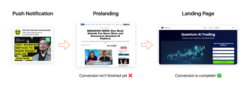
Next, we’ll sort out components of the crypto ad funnel, such as pre-landings and landing pages. If you want to master ad creatives in this niche, move on to our crypto guide.
A well-designed pre-landing page can be a game-changer for your crypto campaign. It should be incredibly appealing to ensure users continue their journey down the funnel. Without delving into the complexities of cryptocurrency, make the introduction to your offer captivating and effortless.
Potential customers love bonuses at the start, so highlight this in your headline. The following sections will describe different ways to draw your audience’s attention through pre-landing examples.
Whether it’s a discount, a free trial, or exclusive content, make sure this incentive is prominently displayed on your pre-landing page. This not only captures attention but also encourages users to proceed to the next step.


Incorporating mascots can significantly enhance the appeal of your pre-landing page in the category of crypto offers. Mascots add a friendly and approachable element to your brand, making it more relatable and engaging. They can guide users through the page, provide tips, and create a more personalized experience.

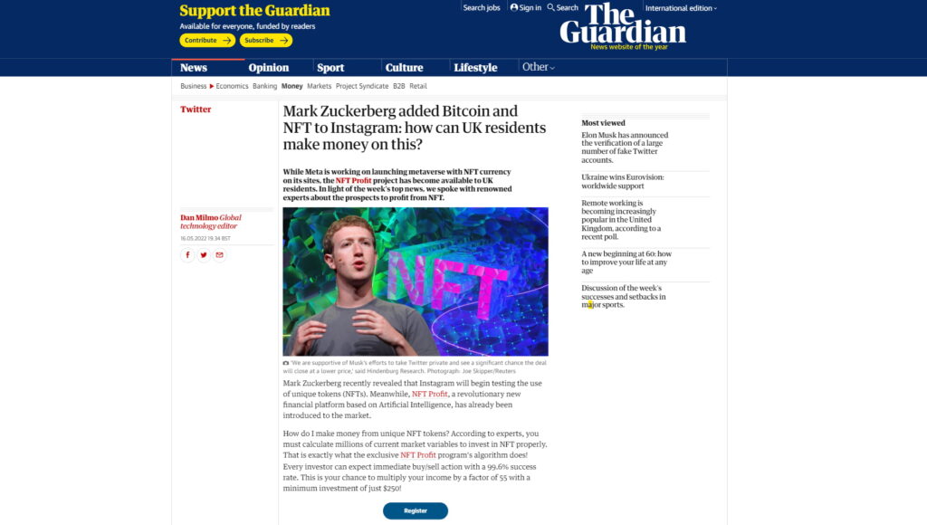
Compelling storytelling elements can keep users engaged. For example, a pre-landing page might feature a headline like “Mark Zuckerberg Added Bitcoin and NFT to Instagram: How Can UK Residents Make Money on This?”. This approach is particularly effective for the segment of tech-savvy, younger individuals interested in the latest trends and investment opportunities in the crypto space.
Throughout an article, strategically placing CTA buttons like “Register” or “Invest” can guide users smoothly towards taking action. Each section of the article naturally leads to a CTA, making it easy for users to proceed without feeling pressured.
Use high-quality images and videos to illustrate your points. Visual content is processed faster by the brain and can convey your message more effectively than text alone. Infographics, explainer videos, and attractive graphics can help simplify complex information and keep users interested.

Watch the full example of this crypto landing page.
Avoid overwhelming your audience with too much information. Keep your pre-landing page concise and to the point. Use bullet points, short paragraphs, and clear headings to break down the content into digestible pieces.
Here’s how else top affiliate marketers are nailing crypto pre-landing pages in 2025:
We can offer you more than just crypto pre-landing examples. See examples of pre-landings and landing pages across other verticals: Nutra, Dating, Adult, Betting, Gambling, Sweepstakes, etc.
Once the pre-landing has set the stage, the landing page needs to seal the deal. Here are some stellar examples and the approaches behind them:
The best landing pages in 2025 immediately highlight their unique value proposition with bold headlines and compelling visuals. For example, offering a contest to predict crypto prices and win 1 ETH and a Tesla Cybertruck engages users and drives interaction with the product.

In the crypto world, trust is everything. Top landing pages prominently feature trust signals such as endorsements from industry experts, security certifications, and testimonials from real users. Including case studies can also add credibility.

A cluttered landing page for the crypto vertical can overwhelm visitors. The trend is towards minimalistic design with high-quality visuals that support the message. Think sleek, modern layouts with plenty of white space, contrasting colors to highlight calls-to-action, and intuitive navigation.
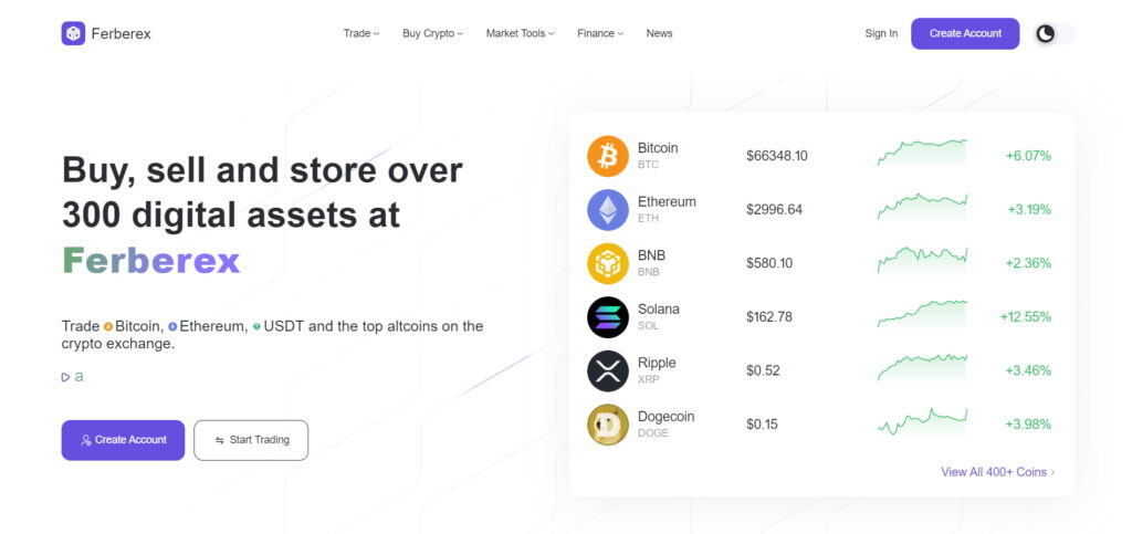
Here are sites where you can see good examples of cryptocurrency landing page design:
Every element of the landing page should guide users towards a clear call-to-action (CTA). It doesn’t matter if it’s signing up for a newsletter or investing in a token, the call-to-action should be compelling and straightforward. Using action-oriented language and offering incentives, like early-bird discounts or exclusive access, can boost conversions.
Crafting effective pre-landing and landing pages for the cryptocurrency industry in 2025 is a nuanced process that requires creativity, strategic thinking, and a deep understanding of user behavior.
The examples and strategies discussed highlight the importance of engaging visuals, clear value propositions, and trust signals. However, the real key to success lies in continually testing crypto ad formats and various bundles, and optimizing your funnel. Pay close attention to analytics to understand which elements resonate most with your audience, and be prepared to adapt your approach based on feedback and performance data.
When you’re trying to capture the attention of potential investors or users, your pre-landing and landing pages must be top-notch. If you’re dealing with the crypto vertical, this is even more crucial. The crypto market is highly competitive and often misunderstood, so clear, compelling, and trustworthy pages are essential to break through the noise and build credibility.
In this article, we will consider best practices for creating target pages within the crypto niche.
Creating a successful funnel for a cryptocurrency site involves a seamless transition from the initial creative elements to the landing page. This process captures user interest, builds engagement, and ultimately drives conversions.
5 components of the quality crypto ad funnel:
An example of the crypto offer funnel:

Next, we’ll sort out components of the crypto ad funnel, such as pre-landings and landing pages. If you want to master ad creatives in this niche, move on to our crypto guide.
A well-designed pre-landing page can be a game-changer for your crypto campaign. It should be incredibly appealing to ensure users continue their journey down the funnel. Without delving into the complexities of cryptocurrency, make the introduction to your offer captivating and effortless.
Potential customers love bonuses at the start, so highlight this in your headline. The following sections will describe different ways to draw your audience’s attention through pre-landing examples.
Whether it’s a discount, a free trial, or exclusive content, make sure this incentive is prominently displayed on your pre-landing page. This not only captures attention but also encourages users to proceed to the next step.


Incorporating mascots can significantly enhance the appeal of your pre-landing page in the category of crypto offers. Mascots add a friendly and approachable element to your brand, making it more relatable and engaging. They can guide users through the page, provide tips, and create a more personalized experience.

Compelling storytelling elements can keep users engaged. For example, a pre-landing page might feature a headline like “Mark Zuckerberg Added Bitcoin and NFT to Instagram: How Can UK Residents Make Money on This?”. This approach is particularly effective for the segment of tech-savvy, younger individuals interested in the latest trends and investment opportunities in the crypto space.
Throughout an article, strategically placing CTA buttons like “Register” or “Invest” can guide users smoothly towards taking action. Each section of the article naturally leads to a CTA, making it easy for users to proceed without feeling pressured.

Use high-quality images and videos to illustrate your points. Visual content is processed faster by the brain and can convey your message more effectively than text alone. Infographics, explainer videos, and attractive graphics can help simplify complex information and keep users interested.

Watch the full example of this crypto landing page.
Avoid overwhelming your audience with too much information. Keep your pre-landing page concise and to the point. Use bullet points, short paragraphs, and clear headings to break down the content into digestible pieces.
Here’s how else top affiliate marketers are nailing crypto pre-landing pages in 2025:
We can offer you more than just crypto pre-landing examples. See examples of pre-landings and landing pages across other verticals: Nutra, Dating, Adult, Betting, Gambling, Sweepstakes, etc.
Once the pre-landing has set the stage, the landing page needs to seal the deal. Here are some stellar examples and the approaches behind them:
The best landing pages in 2025 immediately highlight their unique value proposition with bold headlines and compelling visuals. For example, offering a contest to predict crypto prices and win 1 ETH and a Tesla Cybertruck engages users and drives interaction with the product.

In the crypto world, trust is everything. Top landing pages prominently feature trust signals such as endorsements from industry experts, security certifications, and testimonials from real users. Including case studies can also add credibility.

A cluttered landing page for the crypto vertical can overwhelm visitors. The trend is towards minimalistic design with high-quality visuals that support the message. Think sleek, modern layouts with plenty of white space, contrasting colors to highlight calls-to-action, and intuitive navigation.

Here are sites where you can see good examples of cryptocurrency landing page design:
Every element of the landing page should guide users towards a clear call-to-action (CTA). It doesn’t matter if it’s signing up for a newsletter or investing in a token, the call-to-action should be compelling and straightforward. Using action-oriented language and offering incentives, like early-bird discounts or exclusive access, can boost conversions.
Crafting effective pre-landing and landing pages for the cryptocurrency industry in 2025 is a nuanced process that requires creativity, strategic thinking, and a deep understanding of user behavior.
The examples and strategies discussed highlight the importance of engaging visuals, clear value propositions, and trust signals. However, the real key to success lies in continually testing crypto ad formats and various bundles, and optimizing your funnel. Pay close attention to analytics to understand which elements resonate most with your audience, and be prepared to adapt your approach based on feedback and performance data.

Blog

Blog